32 section redesigns for home remodeling and construction contractors. Everything below describes what’s actually visible in the screenshots. Nothing is assumed.
Each pair below shows the original screenshot beside the rebuilt version. Both panes scroll independently inside their own frame, so a full-page screenshot stays readable without stretching this article. On a phone, use the Before / After toggle on each card.
A hero with no way to contact anyone
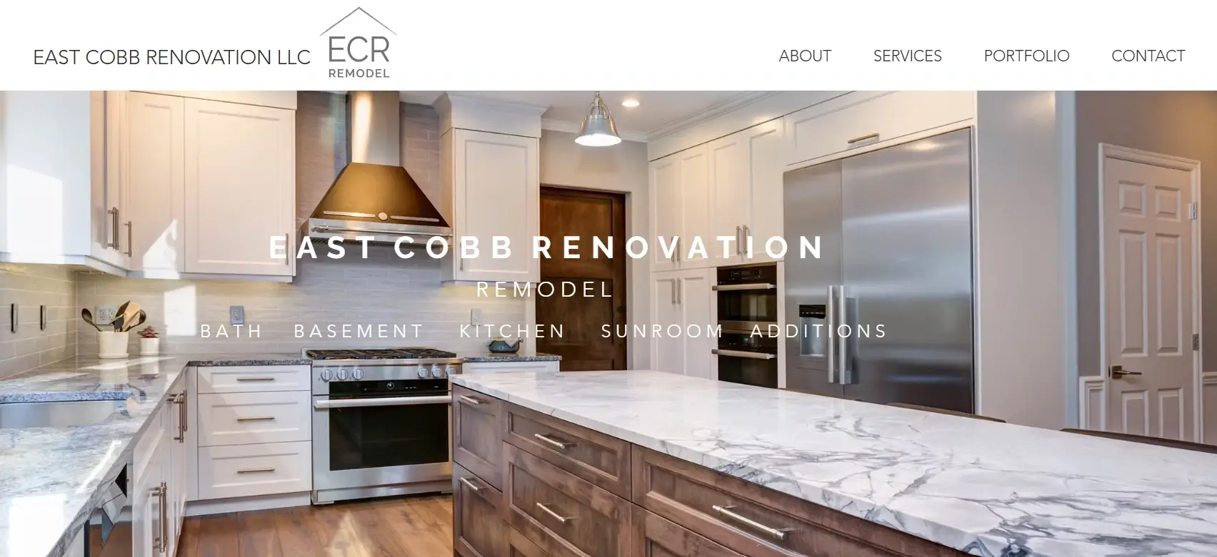
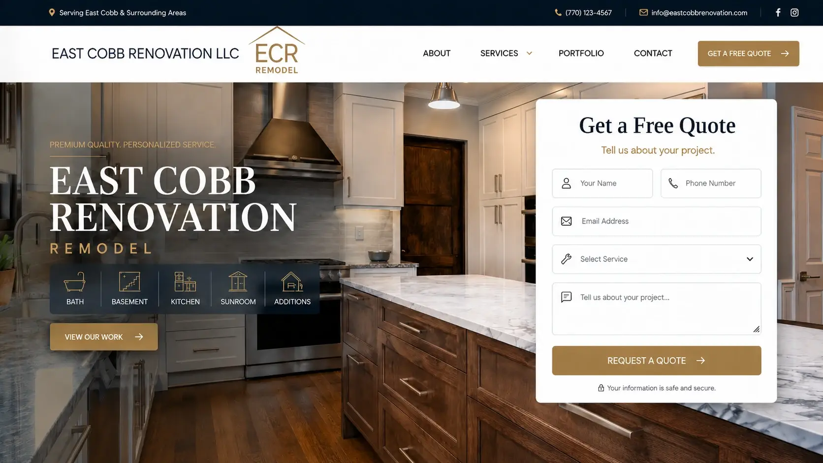
The old header had a logo and four links. About, Services, Portfolio, Contact. That was it. No phone number, no email, no button. If you landed on this page ready to hire someone, your only option was to click Contact and hope.
Meanwhile the company name sat across a kitchen photo in thin, widely spaced capitals, with the service list underneath in the same treatment. Both were hard to read against a busy image. If that describes your own header, compare that with our Marietta rebuilds.
The rebuilt version puts a slim bar across the top carrying the service area, phone number, email and social links. There’s a “Get a Free Quote” button in the nav. The hero itself now has a readable headline, five service icons for Bath, Basement, Kitchen, Sunroom and Additions, a button through to past work, and a quote form sitting right there in the hero.
The point of all this is simple. Someone who wants to call East Cobb Renovation can now do it in one tap instead of hunting. And the people who’d rather not phone a stranger have a form in front of them before they scroll.
Service names competing with the photos behind them
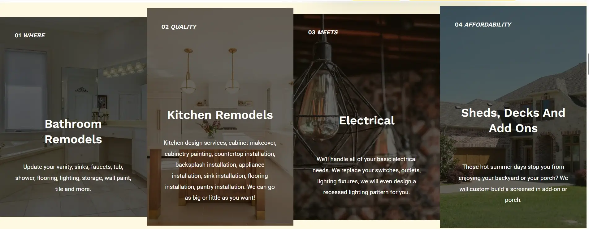
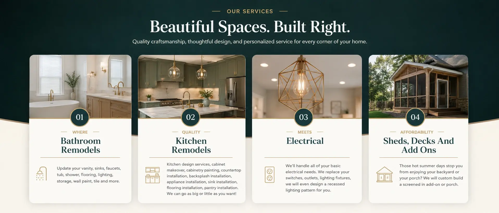
Four services, all with their titles printed straight onto photographs: Bathroom Remodels, Kitchen Remodels, Electrical, and Sheds, Decks and Add Ons. The panels ran to different heights and the numbering was small enough to miss entirely.
Now each service is a card of matching height. Photo on top, text on clean white below, numbered badge on the card, icon for each service. A heading was added above the row so it reads as a section rather than four loose images.
Homeowners don’t read service lists. They scan them, looking for the one job they came for. Cards of equal height with text on a plain background let that happen in about two seconds.
Six good arguments with nothing holding them together
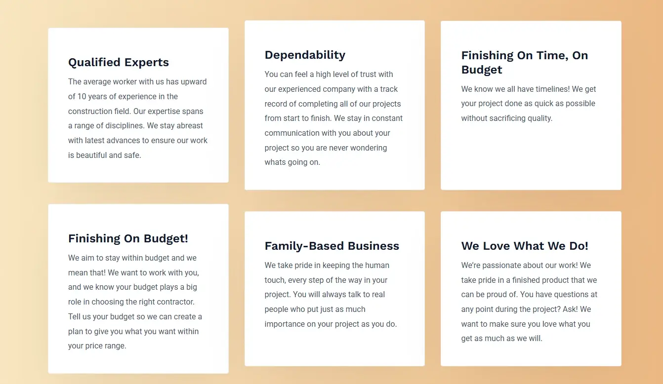
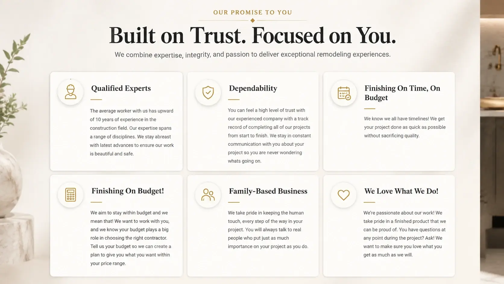
Six reasons to hire this company, sitting on an orange gradient as plain text cards. Qualified Experts, Dependability, Finishing On Time and On Budget, Finishing On Budget, Family-Based Business, We Love What We Do. No heading above them, no icons, and because the copy lengths varied the whole row looked lopsided.
The redesign gives the section a name: “Our Promise To You. Built on Trust. Focused on You.” Each card got an icon and the grid was levelled out.
That heading does more work than it looks like it does. These six points are the entire case for hiring this contractor over the one down the road, and without a frame around them they read as filler. Call it a promise and it becomes a claim the company is making.
The form looked like paperwork
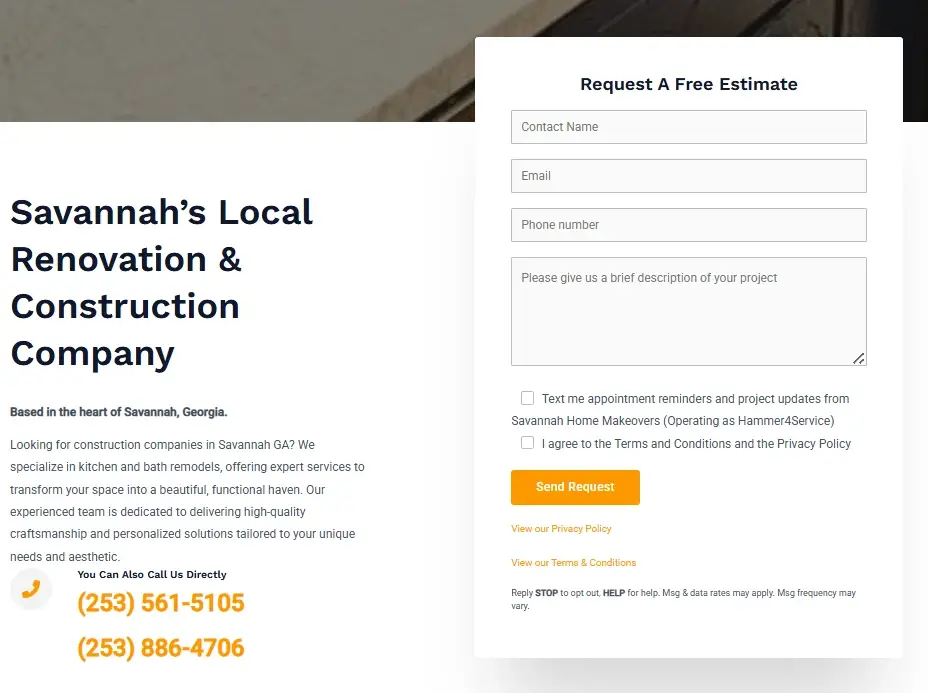
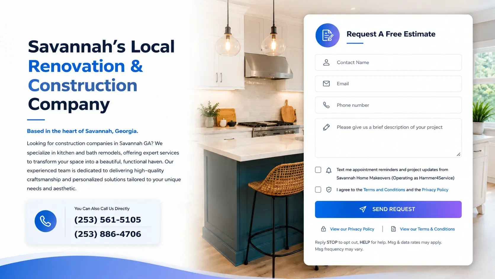
Five fields. That’s all the old estimate form asked for. But it looked longer, because the fields were unlabelled grey boxes and the button had two consent checkboxes and several lines of small legal text stacked underneath it. The intro copy beside it started underneath a photo that had been cut off mid-image.
The new version is a proper split layout. Headline with the key words picked out, body copy, and the two phone numbers pulled into their own bordered card with a phone icon. Inside the form, every field got an icon. The Send Request button became a full-width coloured bar and the consent text was restyled with the links made visible. That is the shape we use for Savannah estimate forms, rebuilt properly.
Requesting a free estimate is the whole purpose of this page. When a five-field form looks like a mortgage application, people start it and abandon it. Making it feel shorter than it is costs nothing and keeps those enquiries.
Twenty years of experience, in six-point type
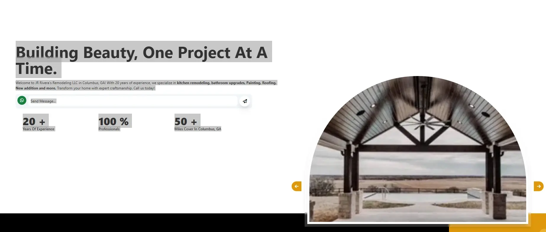
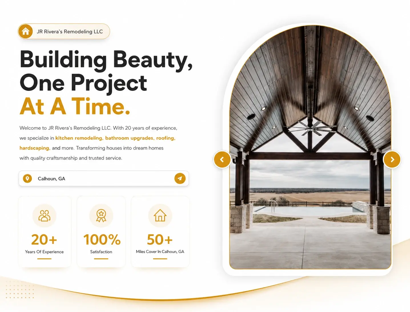
Twenty years in business, and it was set in text smaller than the body copy.
The old hero had a headline with a grey highlight sitting across it, tiny paragraph text underneath, and the three credibility figures (20+ years of experience, 100% professionals, 50+ miles covered) laid out as plain text you’d skim straight past. Below all that, a wide black band took up the bottom third of the screen with nothing in it at all.
I’d guess the black band wasn’t a decision. It looks like something that broke and nobody scrolled far enough to notice.
The rebuild enlarges the headline, drops the highlight, and adds the business name as a badge above it. The three figures became icon cards with proper weight. There’s a location field with a send button, round arrow controls on the image carousel, and a curved divider closing the section off.
For a remodeler, twenty years is the argument. It’s the thing that separates you from the guy who started last spring. Burying it in small text and then leaving a black hole underneath makes the whole page look like it’s still under construction.
Says what it does, never says how well
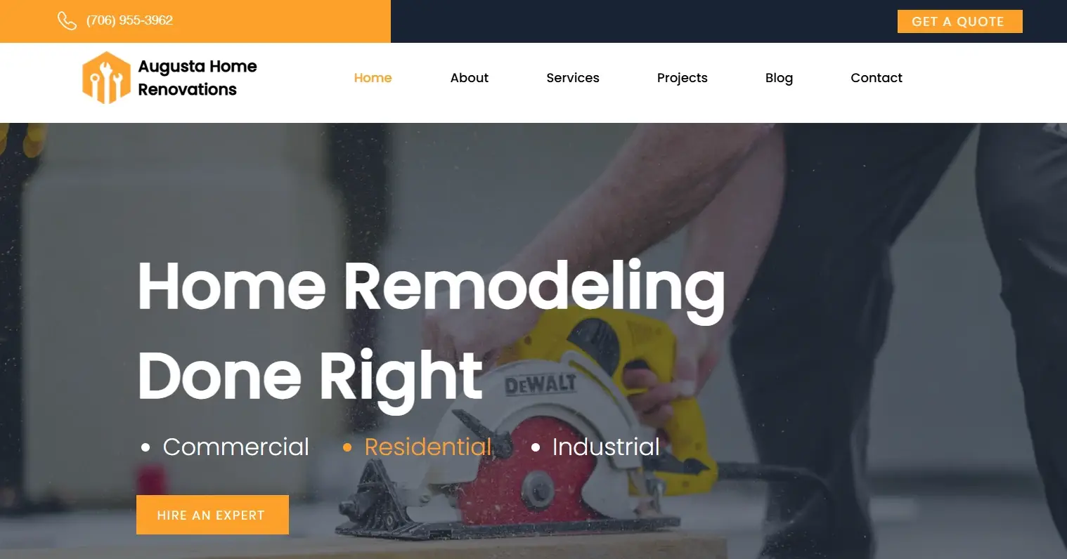
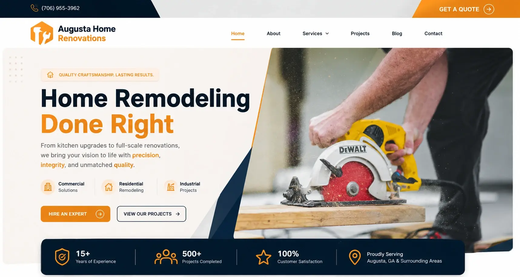
The hero had a headline, three words (Commercial, Residential, Industrial) and one button. Nothing about how long the company had been trading, how many jobs it had finished, or which towns it covered.
Now there’s an eyebrow line, a supporting sentence, and those three words have become labelled icons. A second button was added next to “Hire An Expert” for people who want to see the work first. Underneath the hero sits a dark statistics bar: 15+ years of experience, 500+ projects completed, 100% customer satisfaction, and “Proudly Serving Augusta, GA & Surrounding Areas.” On our side, proof-first heroes are the Augusta baseline.
Fifteen years and five hundred projects is the answer to the question every homeowner is silently asking. Putting it above the fold means they get the answer before they decide whether to keep reading. Naming Augusta in the same bar settles the other question, which is whether this company even comes out their way.
White text on a wall of orange
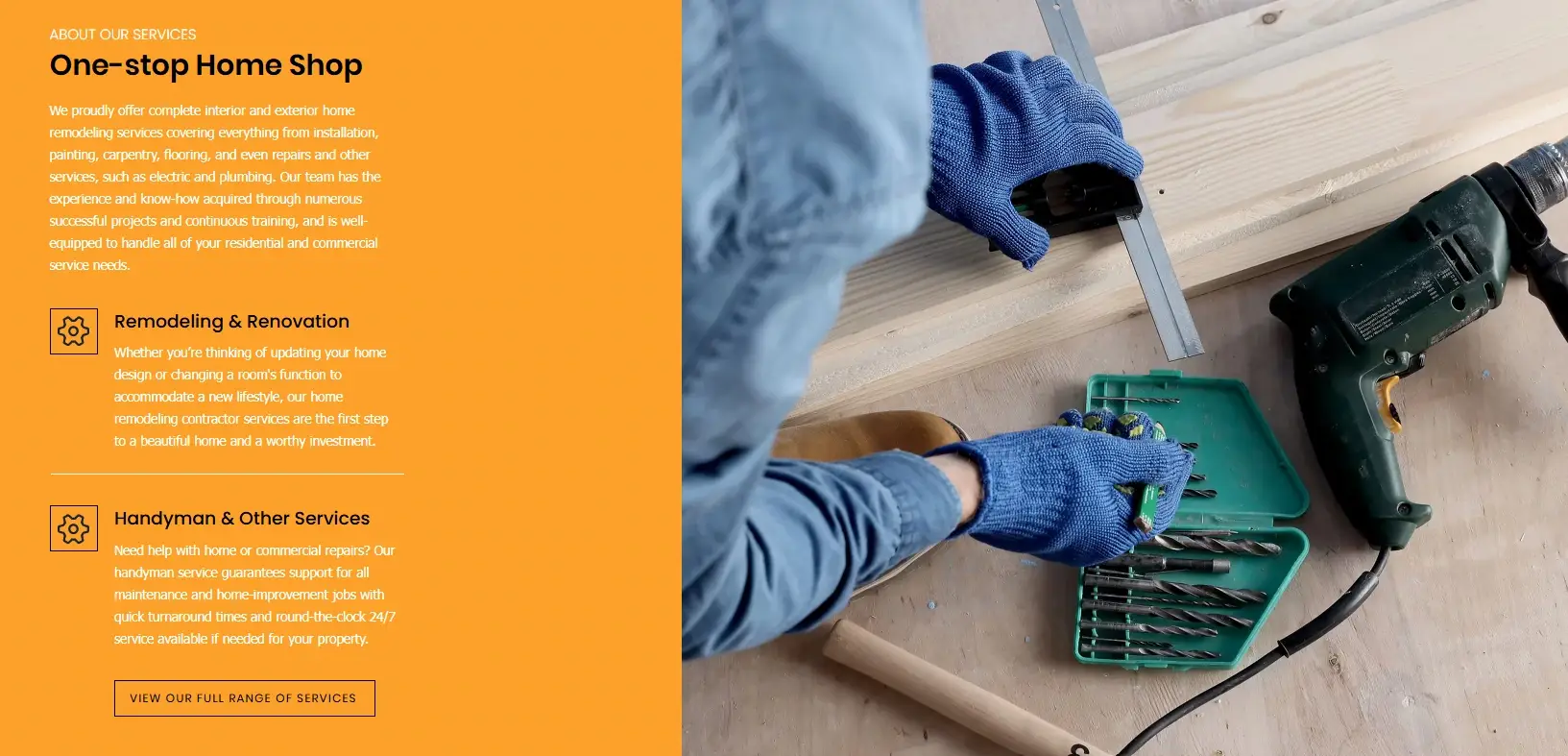
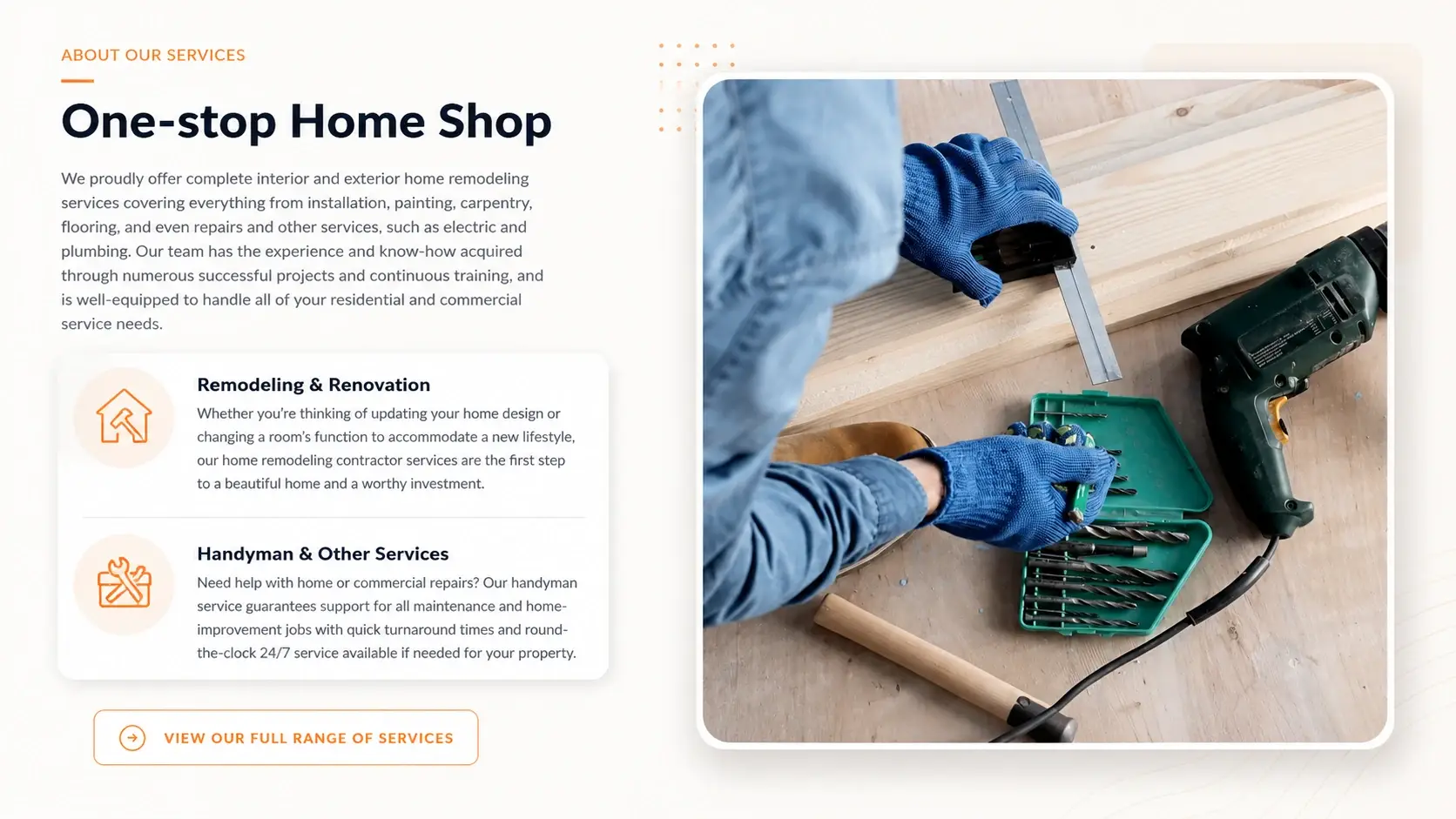
The whole left half of this section was a solid orange rectangle with every word in white on top of it. Heading, full paragraph, two service descriptions, all in one dense field of colour. The icons were small square outlines and the button was a thin white line, so nothing had any hierarchy.
Moving the section onto a white background fixed most of it. Orange eyebrow, dark headline, and the two services grouped into a white card with circular icons. The button became a rounded outline pill with an arrow, and the photograph went into a rounded frame.
The paragraph explaining what Augusta Home Renovations actually covers is now something you’d read instead of something you’d skip. Separating the two services also means a visitor looking specifically for handyman work can spot it.
Three steps, but nothing said they were in order
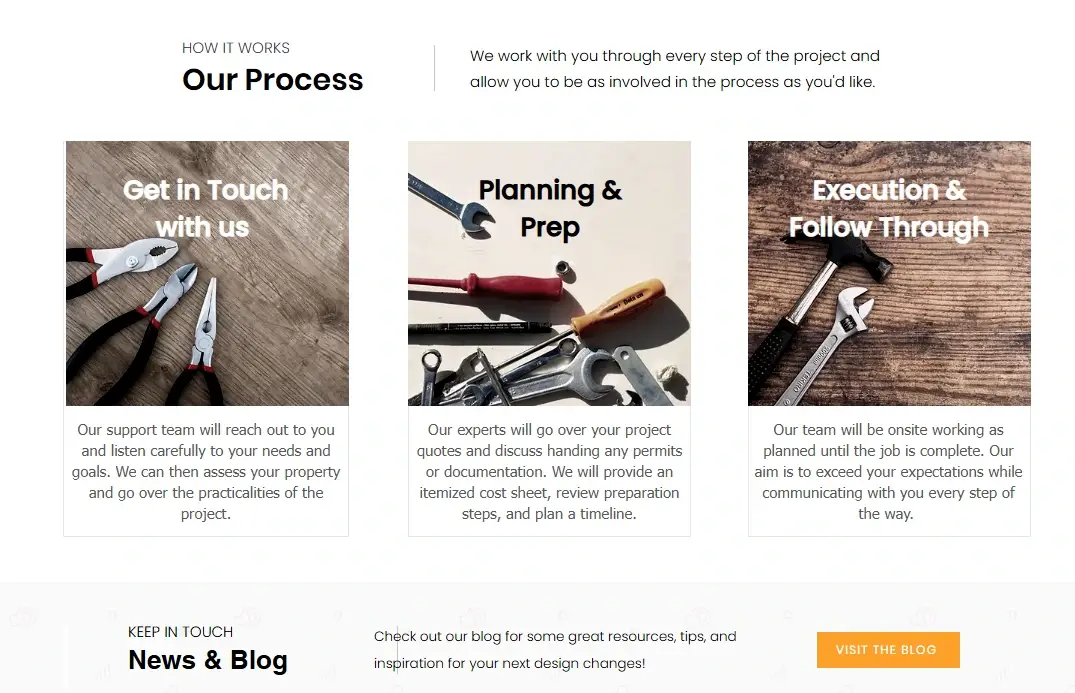
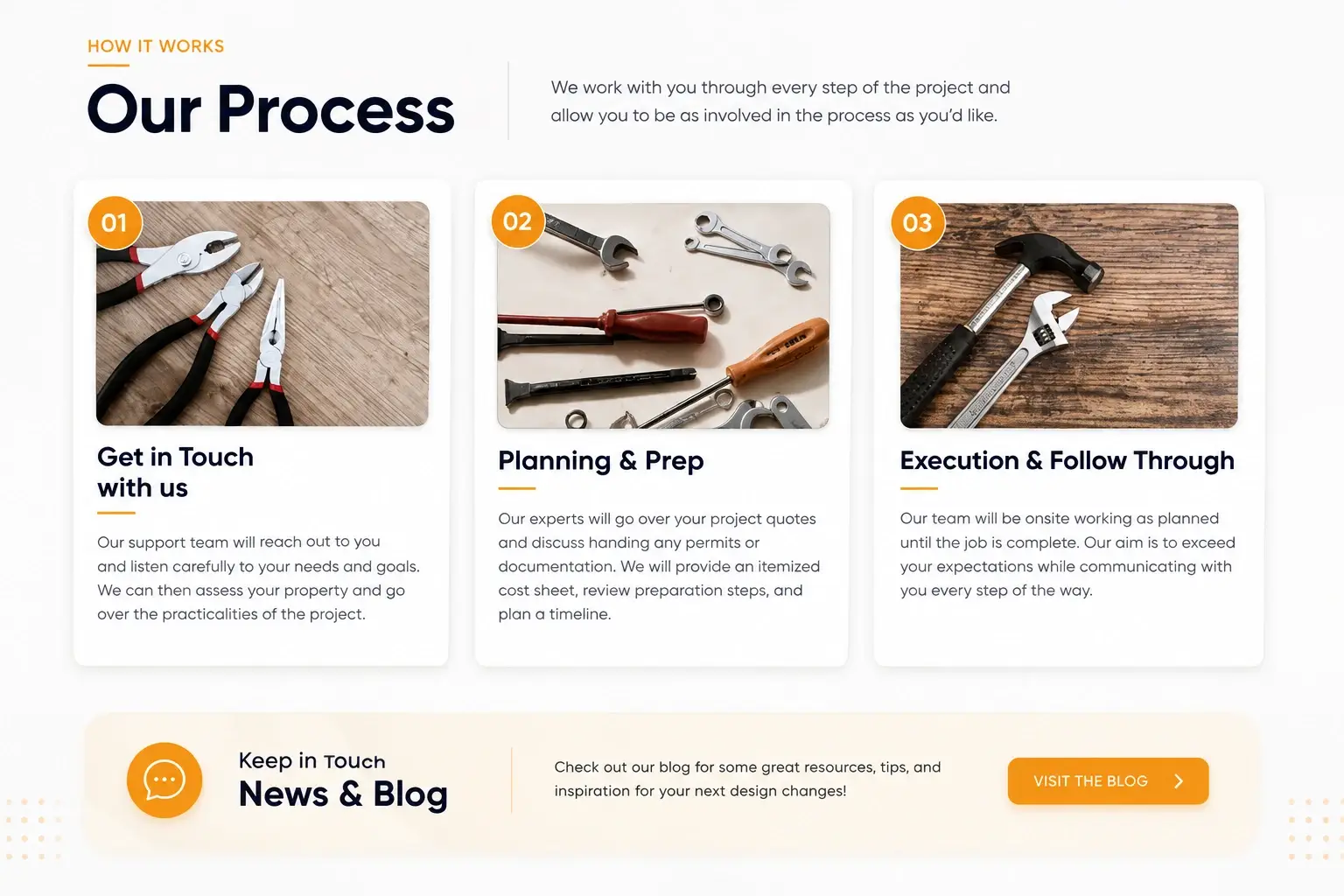
Get in Touch with us, Planning and Prep, Execution and Follow Through. The titles were printed over photographs of tools, descriptions sat below in plain bordered boxes, and nothing marked the sequence. Three cards side by side that happened to be a process.
Numbered badges went onto the photographs. The titles moved off the images onto clean backgrounds. Cards got spacing and shadows, and the blog band underneath was rebuilt as a soft rounded card with a chat icon. We treat numbered process steps for Georgia contractors as standard.
Not knowing what happens after you sign is the standard remodeling worry. A visibly numbered process answers it before anyone asks, which is worth more than the design polish.
A 4.7 rating, set smaller than the menu
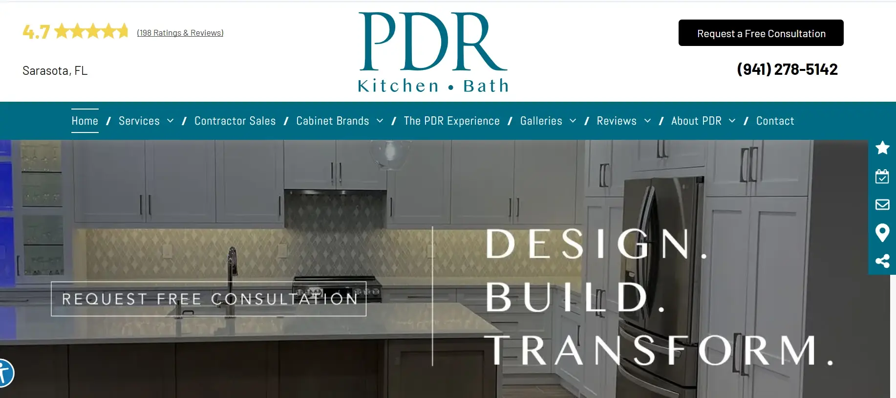
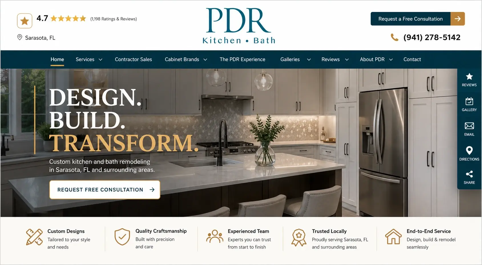
PDR has a 4.7 star rating from a large number of reviews. On the old header it sat in the top-left corner in text smaller than the navigation links, next to the city name.
The headline “Design. Build. Transform.” was pushed to the right side of a busy photograph with no sentence supporting it, and the call-to-action was a thin outline button that barely registered against the image. Down the right edge, a teal rail of unlabelled icons gave no clue what any of them did. Compare that with putting ratings where Sarasota buyers actually look.
The new header puts the rating in a bordered badge with a star icon and marks the location with a pin. The headline moved left, the last word went gold, and a line was added underneath: “Custom kitchen and bath remodeling in Sarasota, FL and surrounding areas.” Those side-rail icons are now labelled Reviews, Gallery, Email, Directions, Share. A strip below the hero lists Custom Designs, Quality Craftsmanship, Experienced Team, Trusted Locally and End-to-End Service, each with a one-line explanation.
That rating is the most persuasive asset this business has and it was the smallest thing on the screen. Everything else here is tidying. The badge is the change that matters.
Holiday closures listed as 05/26/25
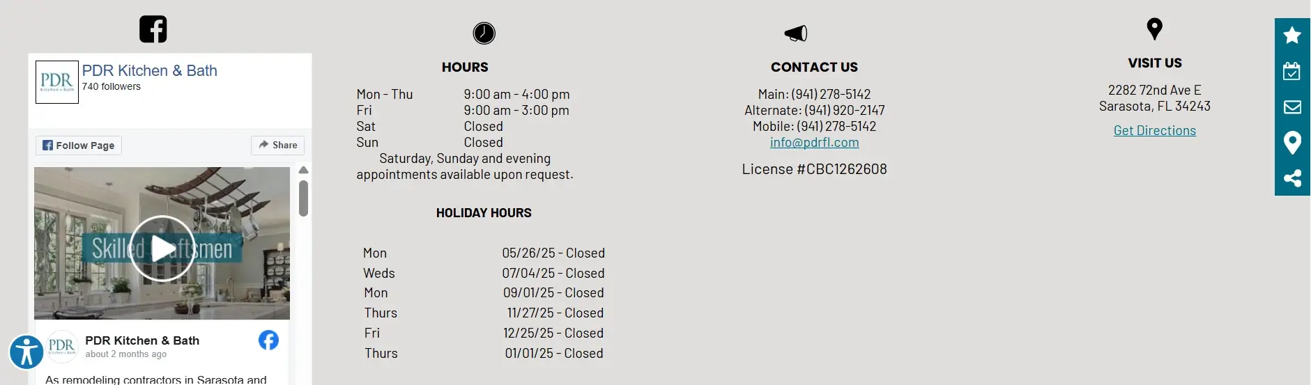
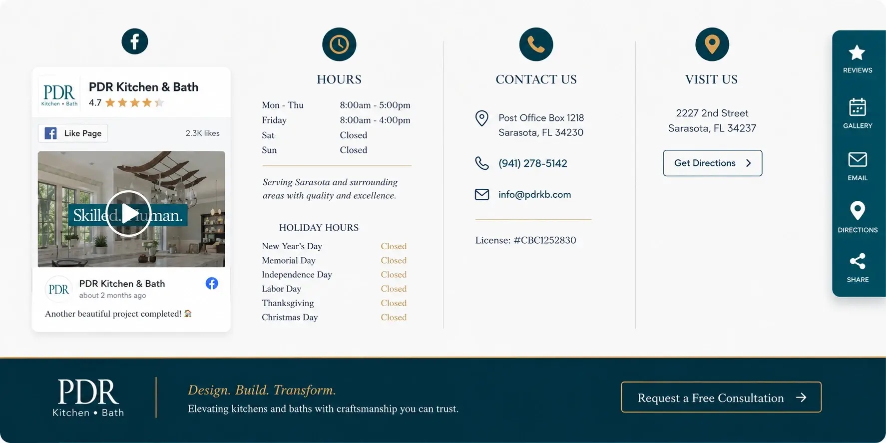
The footer crammed four columns into a grey block with plain black icons. Worst part: the holiday hours were listed as raw dates. 05/26/25, 07/04/25, 09/01/25. You had to work out for yourself that those were Memorial Day, Independence Day and Labor Day.
There was also no call to action anywhere in the footer, which means everyone who read to the bottom of the page hit a dead end.
Each column now has a gold circular icon. The dates were swapped for the actual holiday names. Contact details, licence number and address got spacing and icons, a Get Directions button was added, and a navy band now sits above the footer with a “Request a Free Consultation” button.
Someone reaching the bottom of a page has read the whole thing. That’s the most qualified visitor on the site, and until now they were handed nothing to do.
The strongest proof on the page, formatted as a bullet list
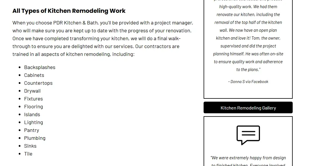
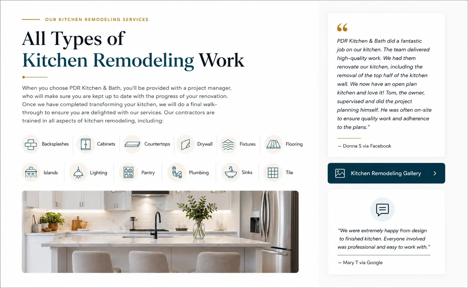
Backsplashes, cabinets, countertops, drywall, fixtures, flooring, islands, lighting, pantry, plumbing, sinks, tile. Twelve trades, running down the page as a bulleted list.
The customer reviews in the sidebar were worse off. Italic text inside thin outline boxes, which made them look like footnotes rather than things real customers said.
Those twelve items are now a two-row icon grid with a finished kitchen photo below. The testimonials became white cards with quote marks and proper attribution: “Donna S via Facebook”, “Mary T via Google.”
The twelve trades are quietly making an important point, which is that PDR handles the whole job in-house rather than bringing in four subcontractors. As icons that message lands without anyone reading the list. And naming the platform each review came from is the difference between a testimonial and something the company typed itself.
The company name filling the hero, four lines deep
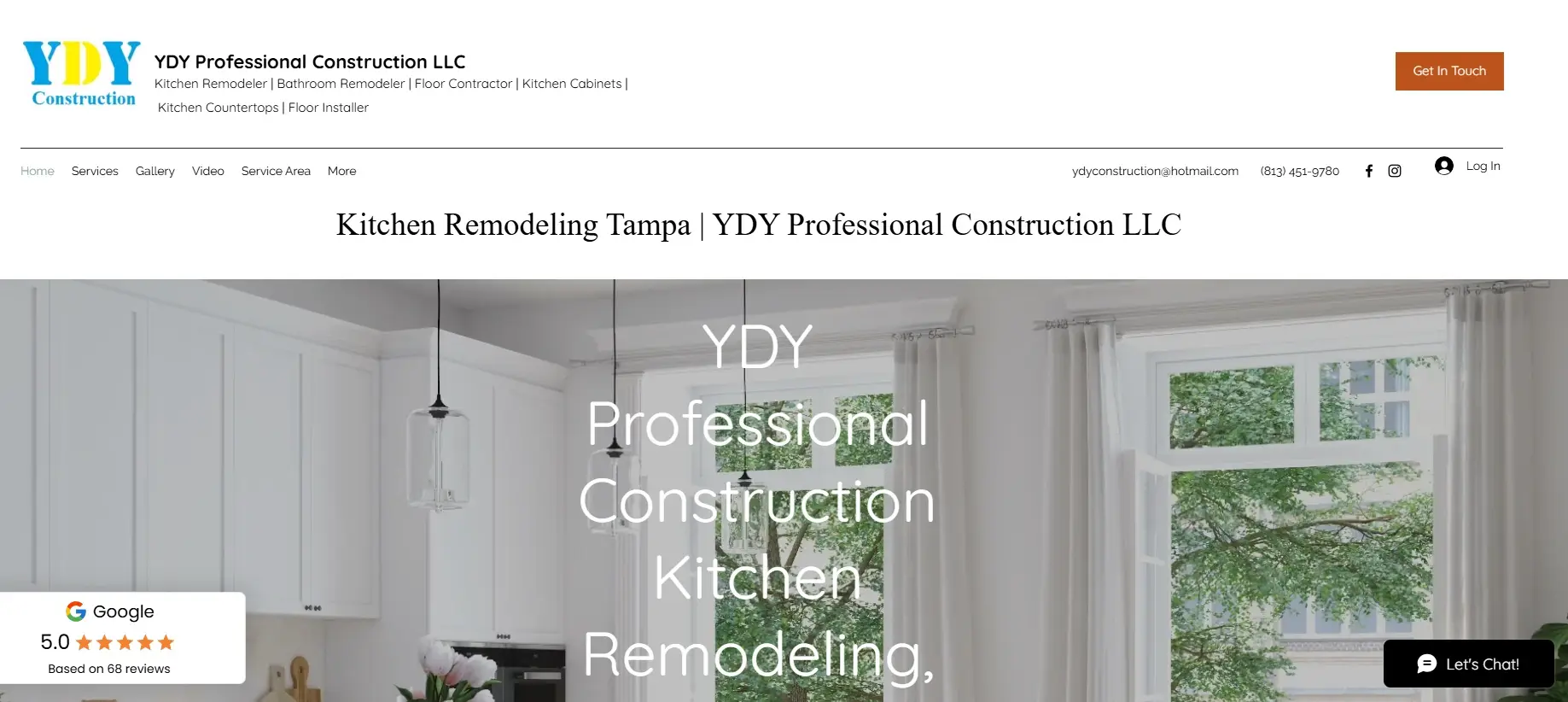
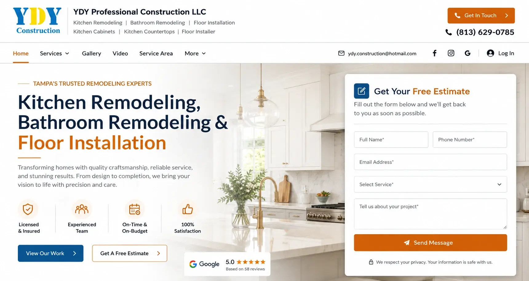
Nobody searches for “YDY Professional Construction.” They search for a kitchen remodeler in Tampa.
The old hero was covered by the company’s own name in very large white type wrapping across four lines of the photograph. Directly under the navigation, a second line repeated “Kitchen Remodeling Tampa | YDY Professional Construction LLC” in case you’d missed it. The header squeezed a long service list into small grey text under the logo, with the phone number and email sitting as plain text among the menu items. The same question drives what a Tampa hero should say.
Now the hero leads with the work: “Kitchen Remodeling, Bathroom Remodeling & Floor Installation,” under the eyebrow “Tampa’s Trusted Remodeling Experts.” Four trust icons were added for Licensed & Insured, Experienced Team, On-Time & On-Budget and 100% Satisfaction. Two buttons, a Google 5.0 badge, and a Get Your Free Estimate form on the right. The phone number in the header is now large with an icon.
Leading with the services rather than the brand answers the visitor’s question first. The Licensed & Insured badge handles the other thing on their mind, which is whether it’s safe to let this company into the house.
Twenty-six towns as blue underlined links
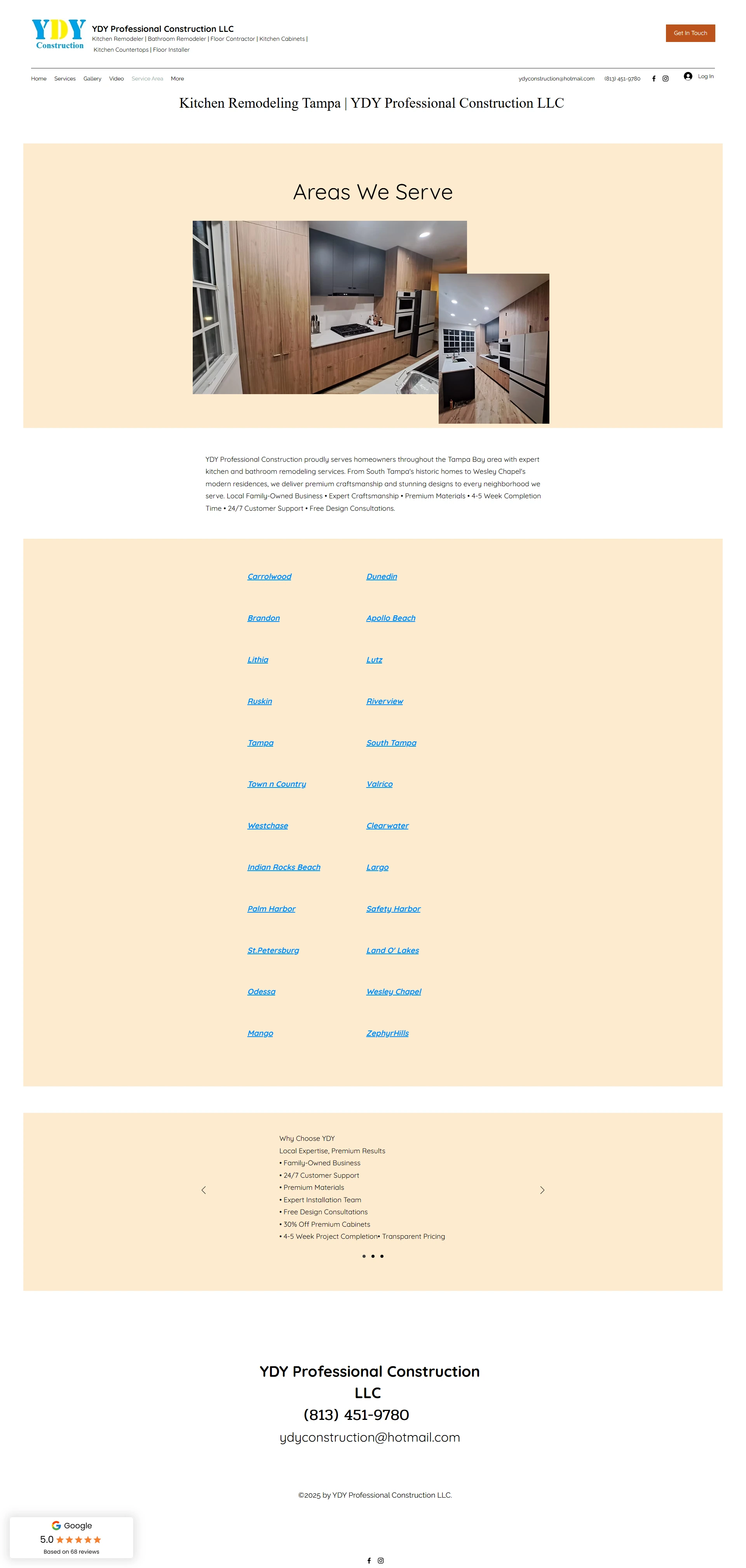
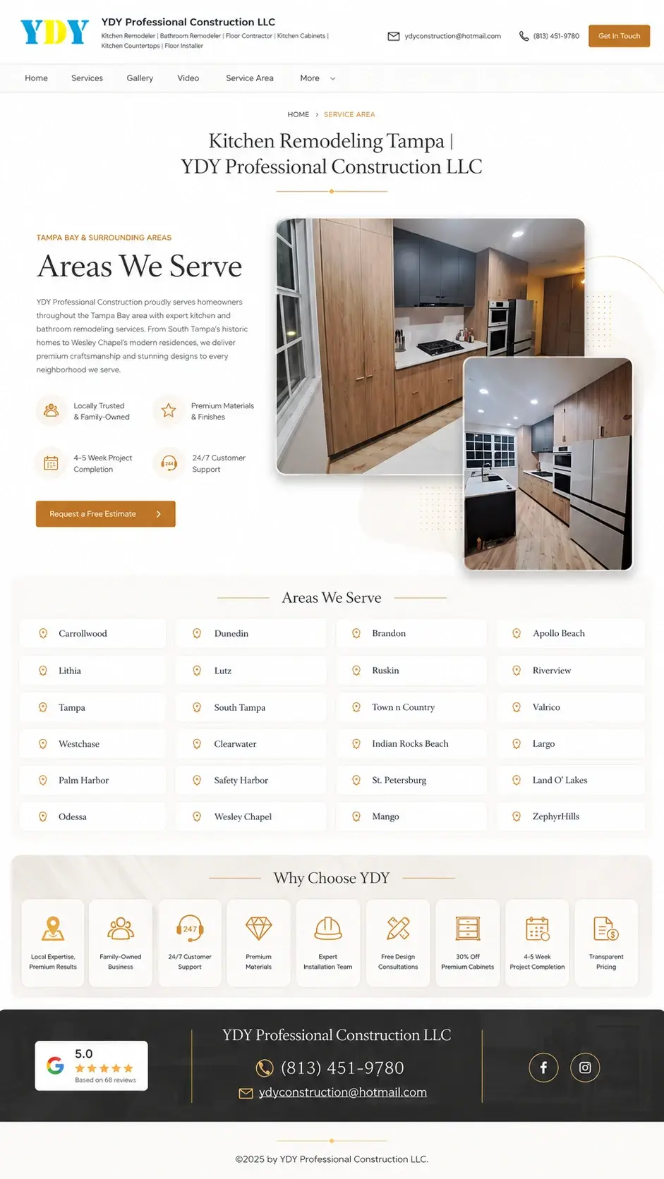
The page opened with a large peach block containing a heading and two photos and not much else. Then came the towns: twenty-six of them, listed as blue underlined italic links in two columns with big empty gaps between the rows. The reasons to choose YDY were buried inside a slider as a plain bullet list, and the intro paragraph ran several claims together separated by bullet characters, like a caption someone forgot to format.
The rebuild adds a breadcrumb, a proper “Areas We Serve” heading, and four supporting icons for Locally Trusted & Family-Owned, Premium Materials & Finishes, 4-5 Week Project Completion and 24/7 Customer Support. The towns became a grid of bordered cards with location pins. Those eight reasons came out of the slider and into a labelled icon row, including Transparent Pricing and Free Design Consultations. This is how we design Florida service-area pages.
This is the page that tells somebody in Clearwater or Wesley Chapel whether YDY will drive out to them. It should be the easiest page on the site to scan and it was the hardest. Pulling the eight reasons out of the slider also means everyone sees them now, not just the small percentage who click through sliders.
The page was so long the call-to-action button broke

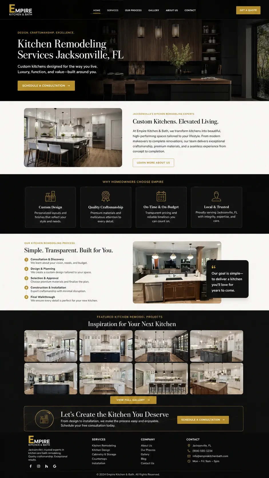
This one ran for thousands of pixels. An intro, a benefits block where all five items used the identical thumbs-up icon, sub-services as plain text headings, a process section cut off behind a Read More, then a gallery of dozens of unedited project photographs including what look like duplicates of the same kitchen.
And at the very bottom, after all that scrolling, the two gold call-to-action buttons were overlapping each other. The words “Get A Free” and “Estimate” were split across two boxes stacked on top of one another.
The rebuild is one screen. Hero with a Schedule A Consultation button, about block, four “Why Homeowners Choose Empire” cards with icons that are actually different from each other, a five-step process with named stages and a quote from the owner, a curated eight-tile gallery with a link through to the full set, one working CTA band, and a four-column footer.
A visitor who has to scroll past sixty near-identical photos to find a phone number usually gives up before they get there. Eight strong images does the same persuading in a twentieth of the distance. And the button works now, which was the more urgent problem.
Trust badges written in grey on grey
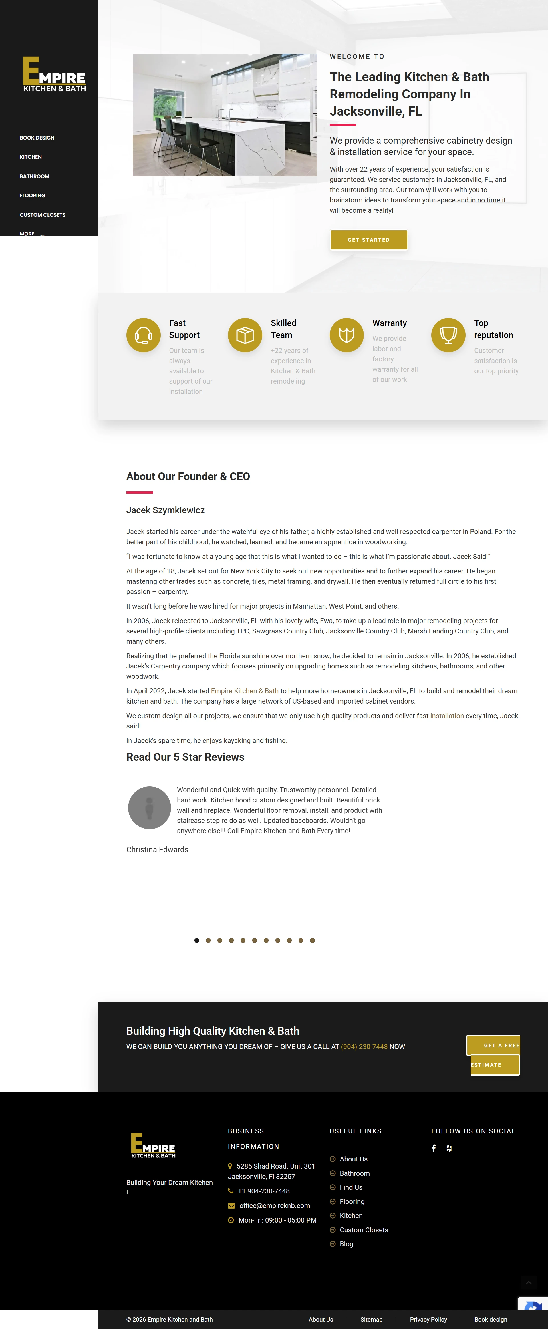
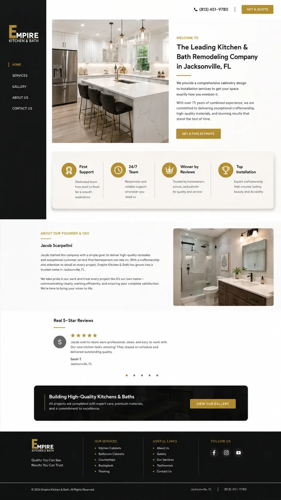
Fast Support, Skilled Team, Warranty, Top Reputation. All four had gold icons and all four had descriptions set in a pale grey that you could barely read against the light background. The warranty badge in particular is a real selling point and it was close to invisible. See how we handle Jacksonville trust badges.
The founder’s story ran to nine paragraphs. Childhood in Poland, apprenticeship, the move to New York at eighteen, the relocation to Jacksonville, the year the company was founded. All of it interesting, none of it something a homeowner comparing three quotes is going to read.
The customer review below used a blank grey placeholder avatar, which is a strange thing to leave on a live site. And the CTA buttons at the bottom overlapped, same as the previous page.
The fix moved the four points into a white card with dark readable text, cut the founder’s story to two paragraphs beside a project photo, gave the review a filled avatar with gold stars and the reviewer’s name and city, and replaced the broken buttons with a single dark card and one clear link through to the gallery.
Two paragraphs of a founder’s story does the same trust-building work as nine. And adding the reviewer’s city turns an anonymous quote into a neighbour.
No button in the header at all

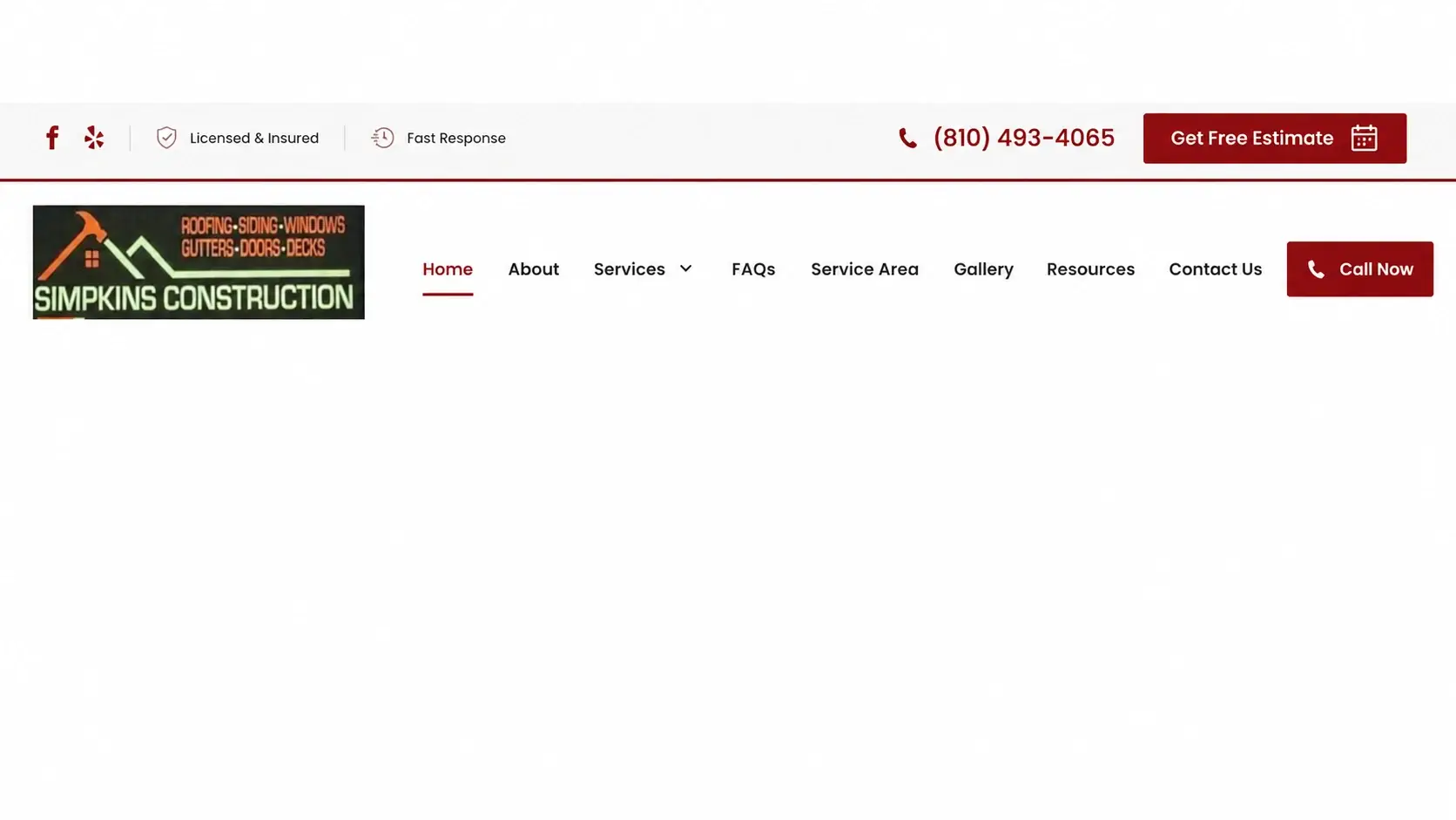
Two small social icons, a phone button, a logo, and eight menu links. That was the entire header. No estimate button, no reassurance, nothing above the fold to suggest why you’d pick this company.
Now the top strip carries Licensed & Insured and Fast Response badges alongside a larger phone number and a red Get Free Estimate button with a calendar icon. The main nav gained a Call Now button and an underline showing the current page.
Headers appear on every page, so a button up there is a route to enquiry from anywhere on the site, including the gallery, the FAQ, and the blog. Putting Licensed & Insured at the very top answers the first question a homeowner in Flint has about a contractor they’ve never met.
A roof measuring tool where the enquiry form should be
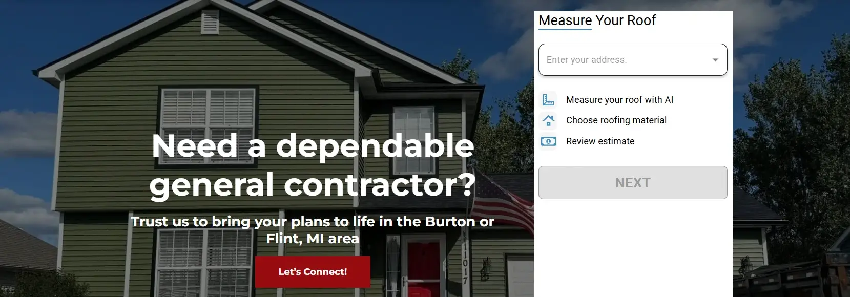
Simpkins does roofing, siding, windows, gutters, doors and decks. The most valuable space on the homepage was given to a widget that measured roofs.
It asked for an address, offered to measure the roof using AI, then let you pick a material and review an estimate. Its Next button was greyed out in the screenshot. Everything else in the hero was a headline and one button.
So if you wanted a deck, or new siding, or gutters, the hero gave you nothing to do.
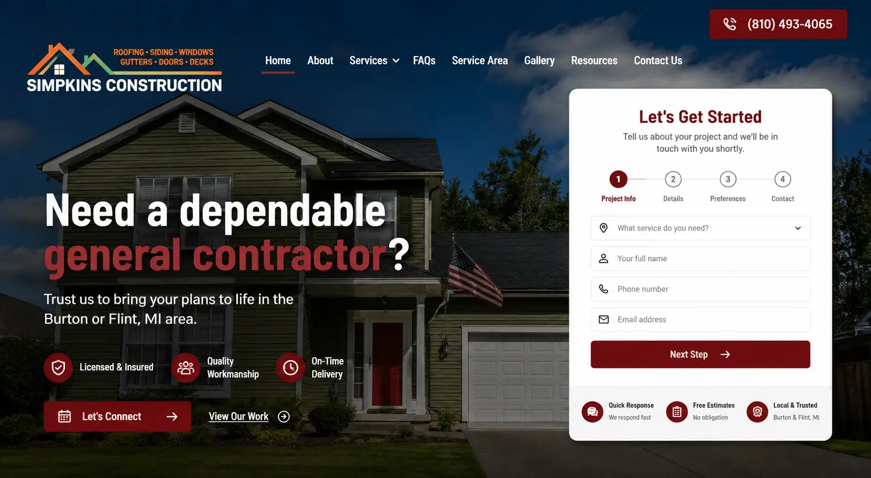
The replacement is a “Let’s Get Started” form that opens by asking what service you need, then runs across four marked stages: Project Info, Details, Preferences, Contact. Three trust icons went under the headline for Licensed & Insured, Quality Workmanship and On-Time Delivery. A View Our Work link sits beside the main button, and three notes under the form read Quick Response, Free Estimates (no obligation), and Local & Trusted. This is what we build when a Flint hero gives visitors nothing.
Splitting a form into four short steps rather than one long one is one of the oldest reliable ways to get more people to finish it. The bigger win is that the hero now works for all six services instead of one.
Twenty-five photos and no way to know what any of them were
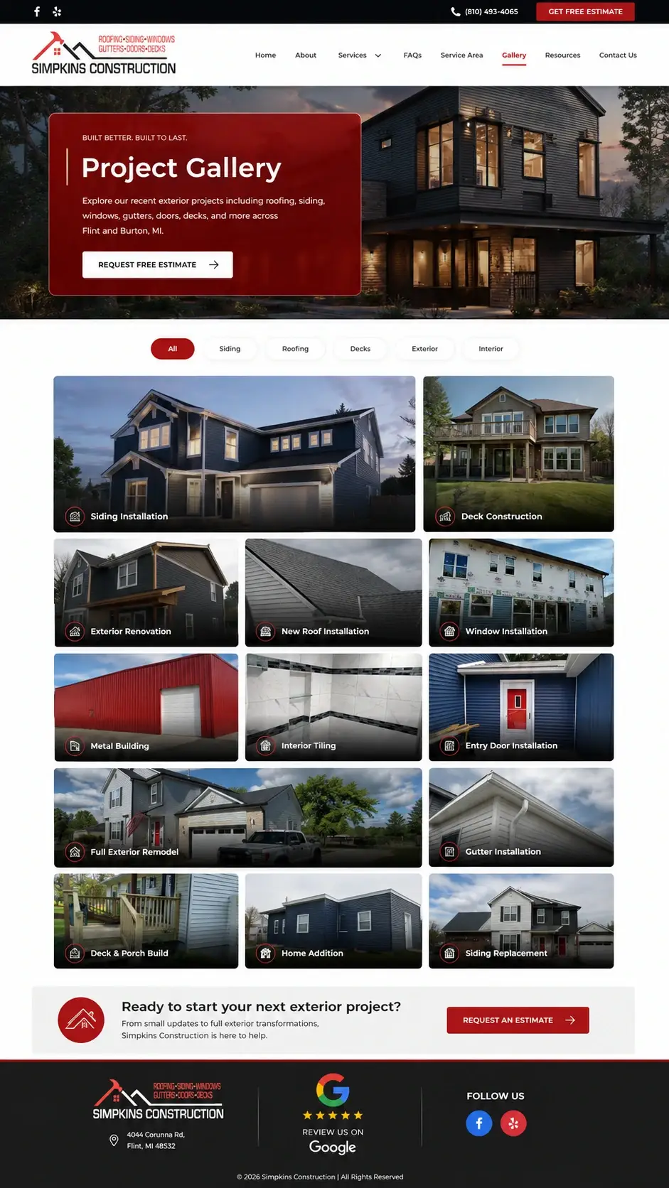
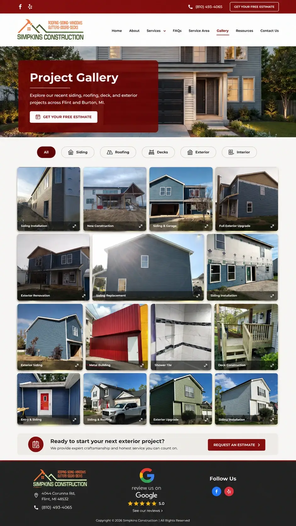
The old gallery was a grid of project photos at mixed sizes with no captions. You could see a blue house. You couldn’t tell whether that was a siding job, a roof replacement, or a full exterior remodel. There was no way to filter and the page banner said only “Gallery.”
The new page opens with a hero explaining what work is covered and an estimate button. Filter chips were added for All, Siding, Roofing, Decks, Exterior and Interior. Every tile now carries a caption: Siding Installation, New Roof Installation, Deck Construction, Full Exterior Upgrade, Window Installation, Shower Tile, and so on. The tiles were levelled to a consistent grid and a CTA band added before the footer. That is the gallery pattern Michigan contractors need.
Someone who came for a deck can click Decks and see decks. That’s the whole thing. Captions turn a photo album into evidence of specific work, which is what people actually open a gallery to find.
The best thing about this company, said once and never explained
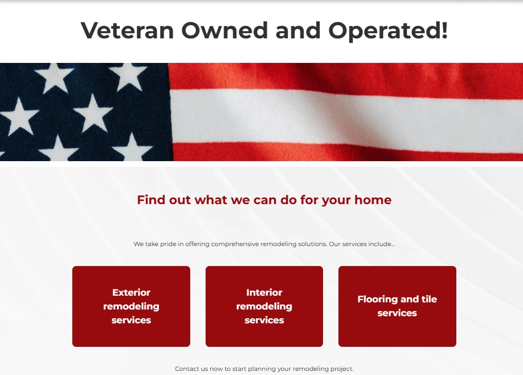
“Veteran Owned and Operated!” sat as a bare black heading above a strip of flag imagery. Nothing after it. No explanation of what that means for the person hiring them.
Below, three services in solid dark red rectangles containing nothing but their names: Exterior remodeling services, Interior remodeling services, Flooring and tile services. No descriptions, no buttons, no way to learn more.
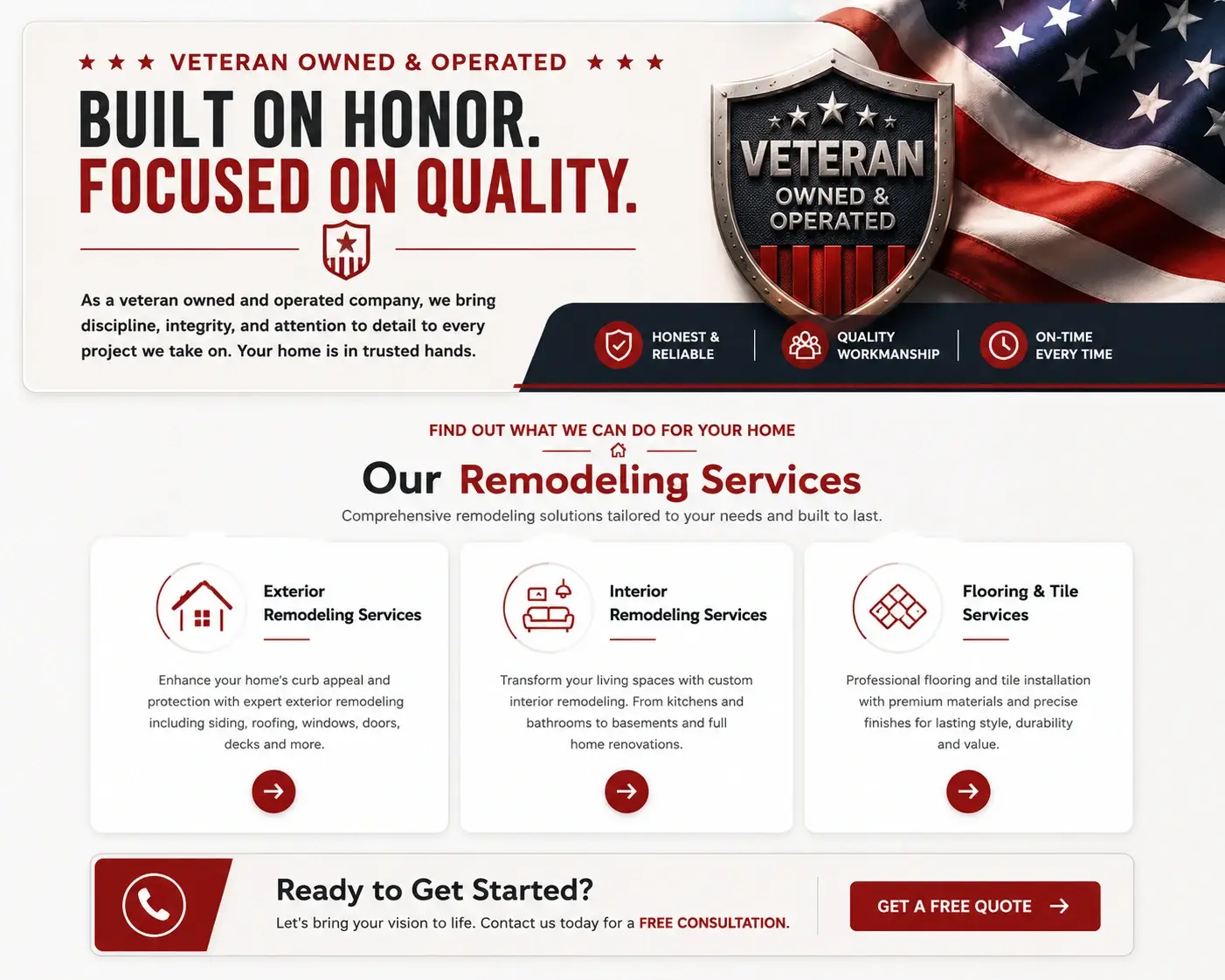
The redesign turns the veteran statement into a card with the headline “Built On Honor. Focused On Quality,” a short paragraph explaining the standard that implies, a veteran shield graphic, and three supporting chips for Honest & Reliable, Quality Workmanship and On-Time Every Time. The three services became white cards with icons, a description each, and an arrow button. A CTA band closes it off with a free consultation offer.
Being veteran-owned is a genuine reason to pick one contractor over another. It was sitting there as a headline with nothing behind it, which converts nobody. Explaining what it means turns a badge into an argument.
Centred bullet lists are slower to read than they look
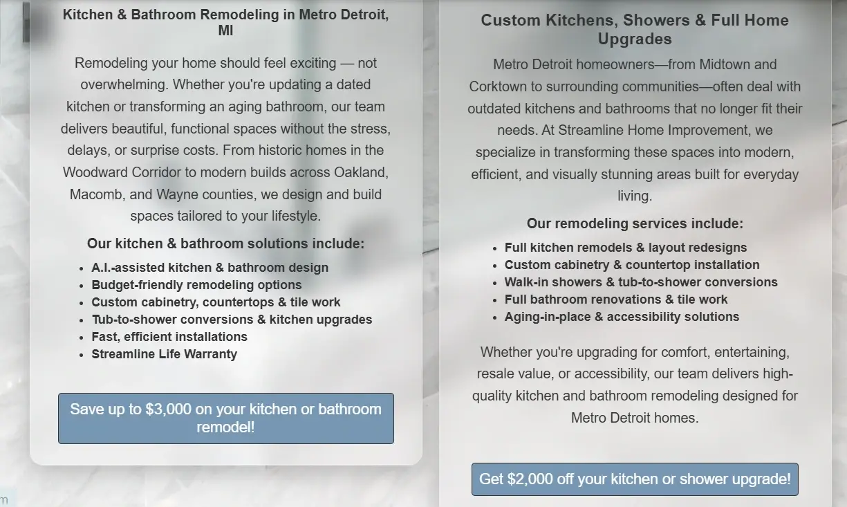
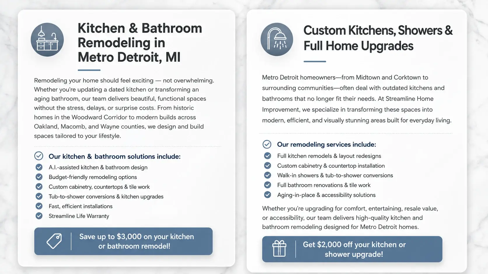
Two blocks of copy over a faint marble background, everything centred, including two service lists of six and five items. Centring a list gives it a ragged left edge, and a ragged left edge means the eye has to find the start of every line. It’s a small thing that adds up across eleven items.
The background pattern also showed through the text, which didn’t help.
Each block became a white card with a circular icon, left-aligned heading with an underline, left-aligned body, and the lists converted to blue tick bullets. The two offers (up to $3,000 off a kitchen or bathroom remodel, and $2,000 off a kitchen or shower upgrade) were rebuilt as full-width coloured bars with a tag icon and a gift icon.
Those lists contain the exact phrases people type into Google, including tub-to-shower conversions and aging-in-place accessibility work. Left-aligned ticks let a homeowner find their job in one pass. And the offers now look like offers rather than another button.
Accreditation logos too small to identify
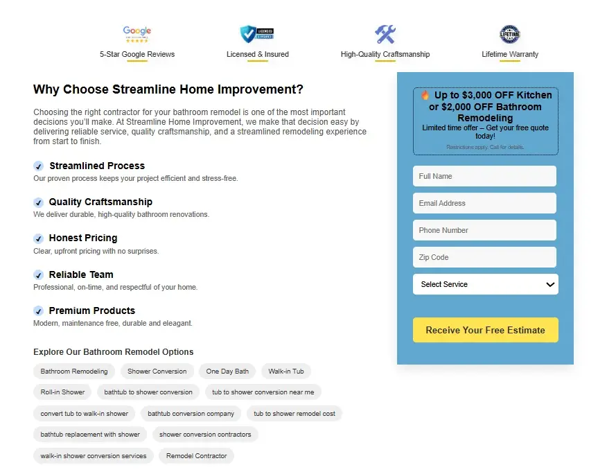
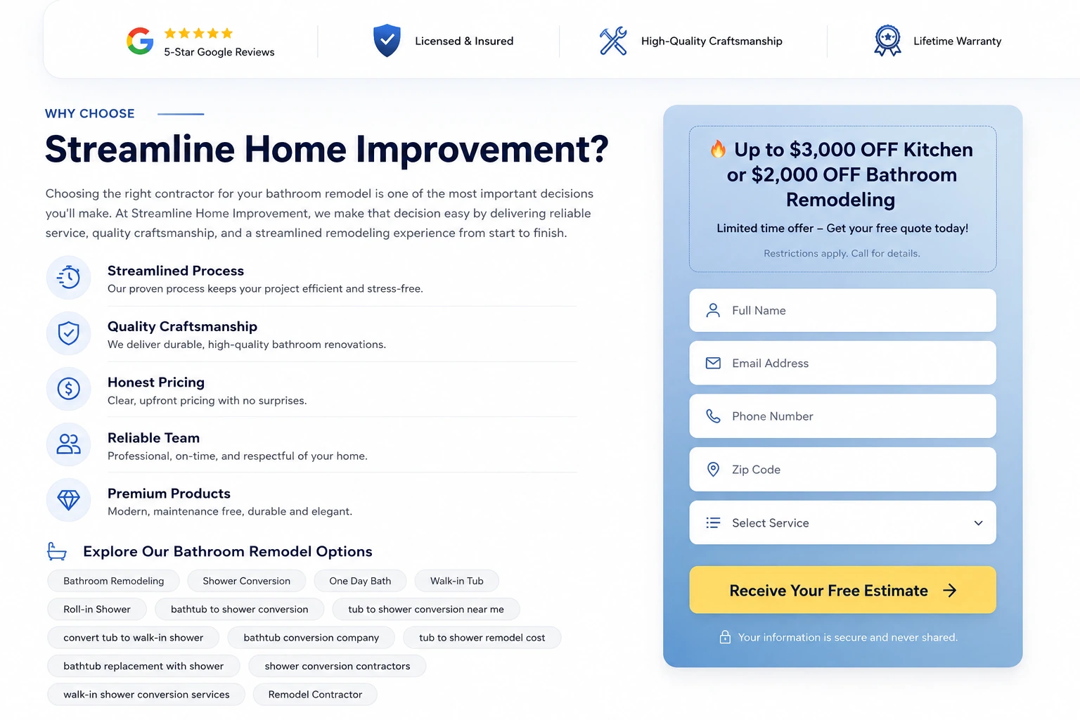
Four trust marks across the top: a Google five-star rating, Licensed & Insured, High-Quality Craftsmanship, and Lifetime Warranty. All four were small, low-resolution images sitting on thin underlines. At normal viewing distance you couldn’t tell what most of them were.
The five reasons below used tiny square tick marks, and the form on the right was a plain box of unlabelled fields inside a blue panel.
The trust row is now a white card with clean, legible marks. The five reasons got circular icons and breathing room. The keyword links underneath became rounded pills with a bookmark icon. The form panel gained a gradient, an offer box at the top, icons inside every field, and a line reading “Your information is secure and never shared” with a padlock.
A Lifetime Warranty only sells if the visitor can read the words. Worth noting that Honest Pricing is one of the five reasons listed, and honest pricing is precisely what homeowners are afraid they won’t get from a remodeler. That one deserved the space it now has.
The security line under the form matters more than it looks. People hesitate before handing over a phone number to a contractor’s website, and one sentence removes a lot of that.
Three rows left blank at the bottom of the table
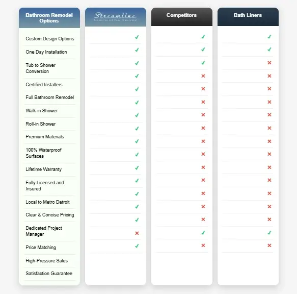
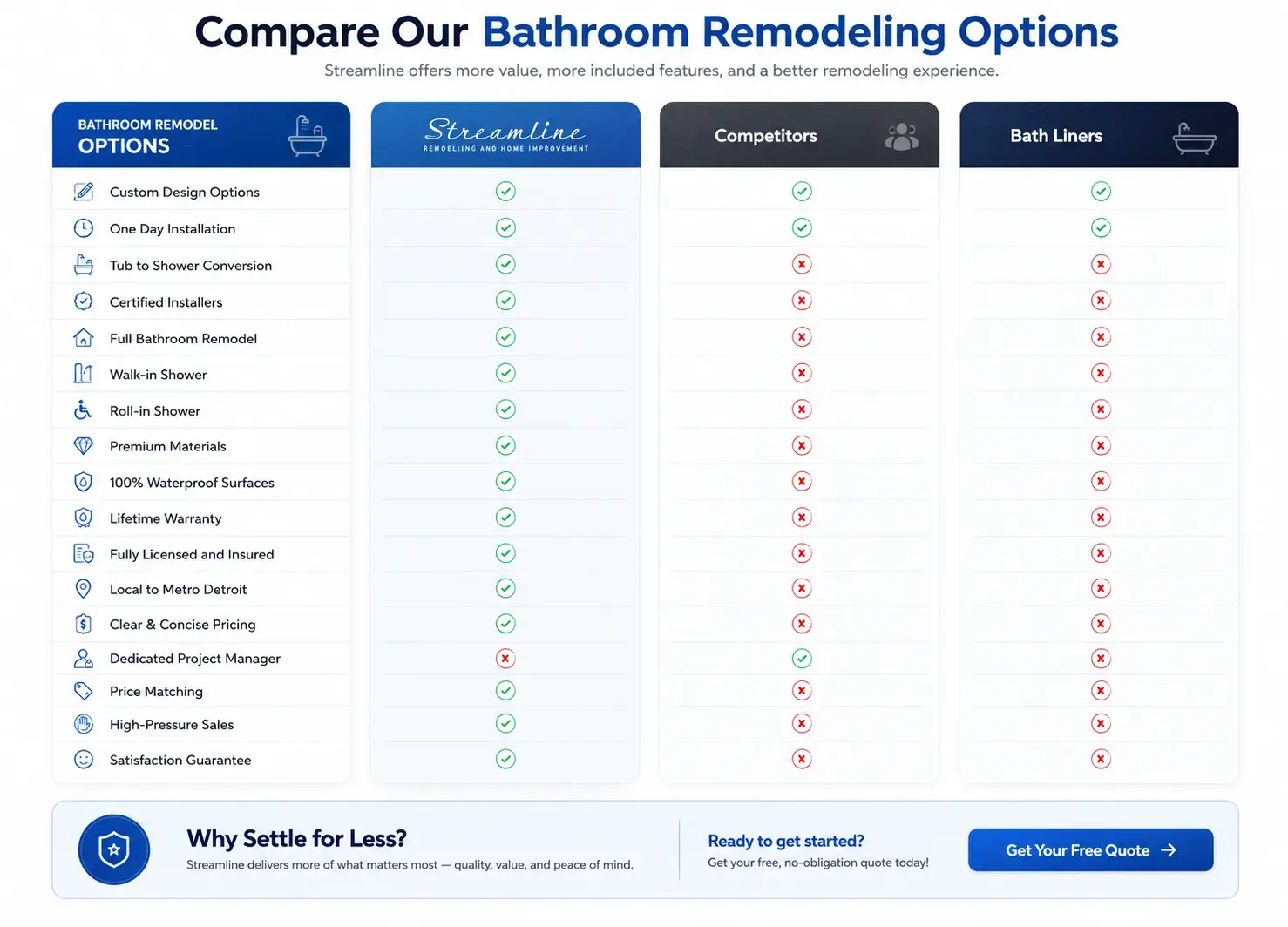
The table compared Streamline against competitors and bath liners across seventeen features. The last three rows (Price Matching, High-Pressure Sales, Satisfaction Guarantee) were empty in every column. No ticks, no crosses, nothing.
There was also no heading above the table telling you what you were looking at, and nothing at the end telling you what to do about it.
The rebuild adds a heading, “Compare Our Bathroom Remodeling Options,” with a supporting line. Column headers got icons and brand colours, every row got an icon, all seventeen rows were filled in, and a “Why Settle for Less?” band with a free quote button was added underneath.
A comparison table works by finishing the argument. Three blank rows at the bottom left it hanging in exactly the place where it should have been strongest, because Satisfaction Guarantee and no High-Pressure Sales are two of the things bathroom remodeling buyers care about most. My guess is nobody meant to leave them empty. Somebody built the table, ran out of content, and never came back to it.
The address and phone number were the smallest text on screen
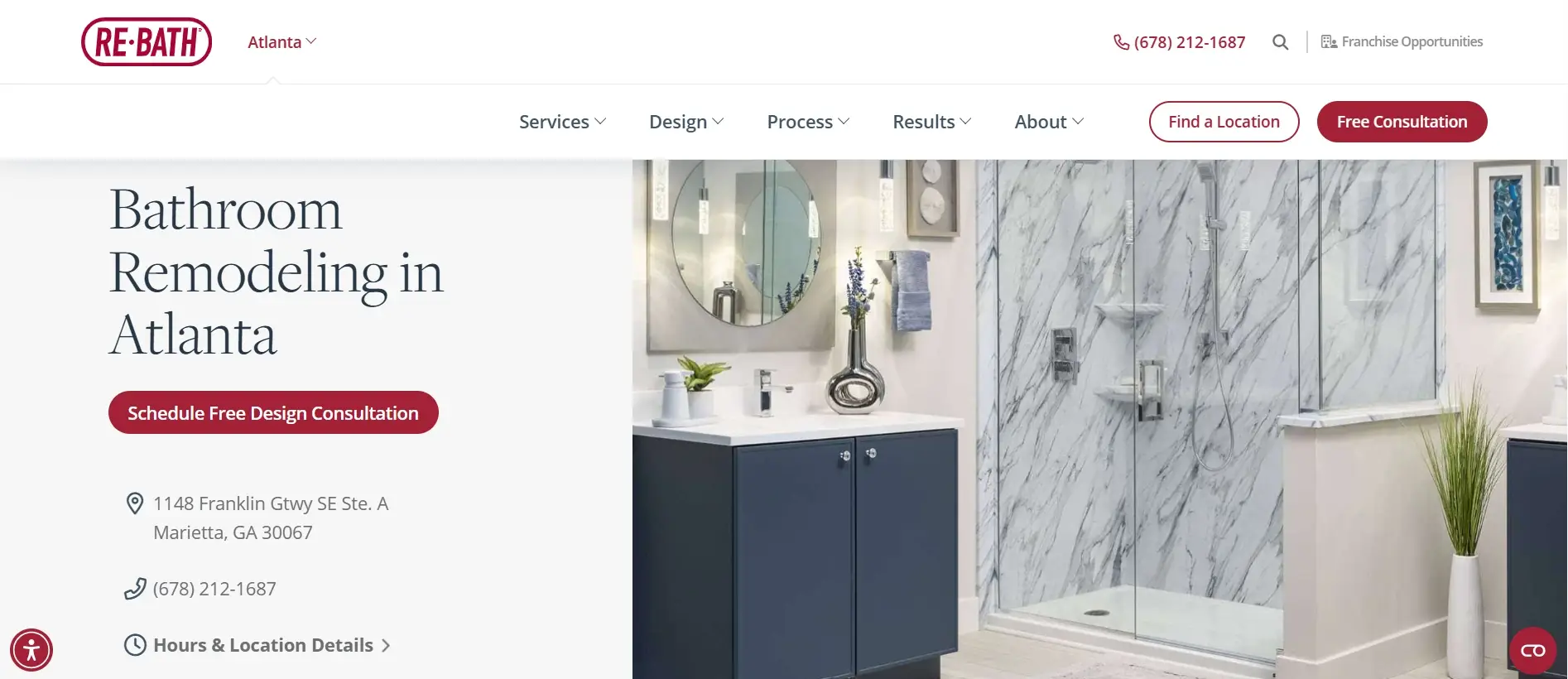
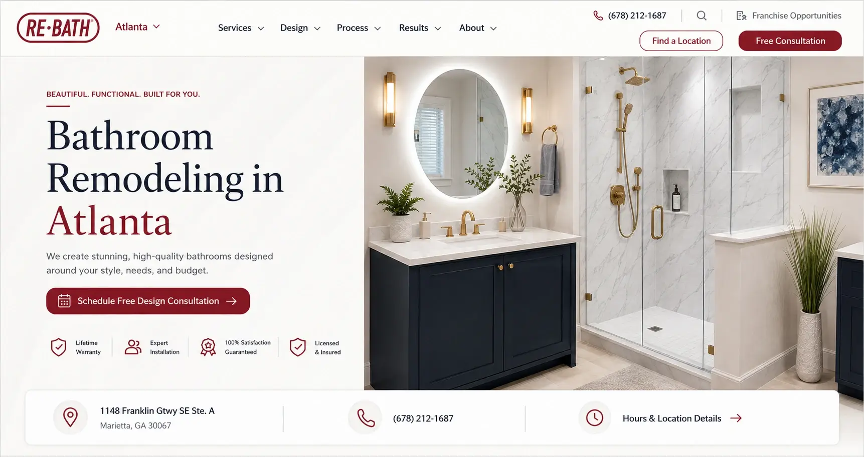
For a business with a showroom, the address and the phone number are the two things most visitors are hunting for. On the old hero they sat stacked under the button in small grey text, below a headline that had no sentence supporting it and no trust information of any kind.
The new hero adds an eyebrow line and a supporting sentence, with “Atlanta” picked out in the brand colour. Four trust icons sit under the button: Lifetime Warranty, Expert Installation, 100% Satisfaction Guaranteed, Licensed & Insured. The address, phone and hours link moved into a white bar running the full width of the hero with icons. It mirrors our approach to Atlanta location pages.
Bathroom remodeling buyers usually collect two or three quotes, and warranty terms often decide it. Putting Lifetime Warranty above the fold is doing real work here, not decoration.
A sub-headline written for Google, not for people
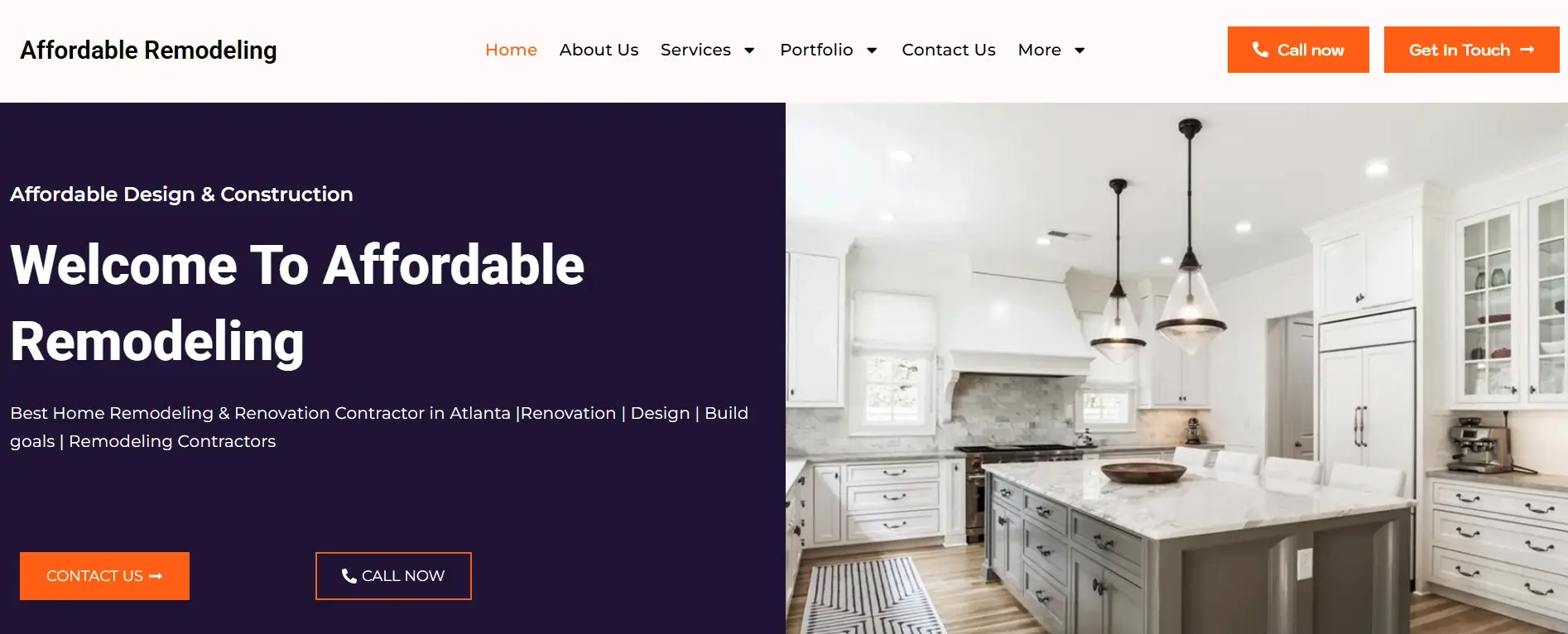
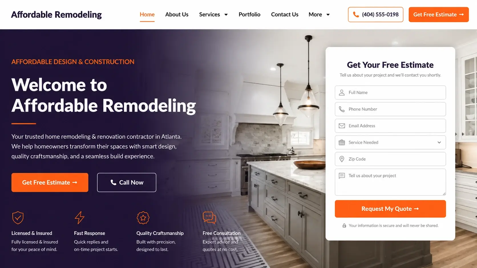
“Best Home Remodeling & Renovation Contractor in Atlanta |Renovation | Design | Build goals | Remodeling Contractors”
That was the supporting line under the headline. A homeowner reading it learns nothing, and the vertical bars make it read like a meta description that escaped onto the page.
The hero was also split down the middle by a hard vertical edge, dark purple block on the left holding all the copy, kitchen photo on the right. No form, no trust information.
Now the photo runs across the full width behind a dark overlay so the two halves connect. The sub-line was rewritten as an actual sentence about what the company does for Atlanta homeowners. A Get Your Free Estimate form card went on the right, the phone number came into the header as a button, and four trust items with one-line descriptions were added for Licensed & Insured, Fast Response, Quality Craftsmanship and Free Consultation.
A form in the hero means an enquiry can happen without scrolling. The four badges give a first-time visitor a reason to trust a company they’ve never heard of, which is most of the battle for a business with a generic name.
Small red text on black, for the emergency number
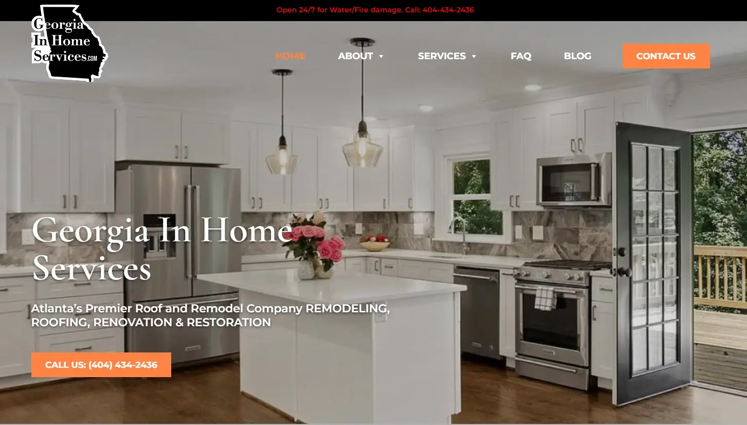
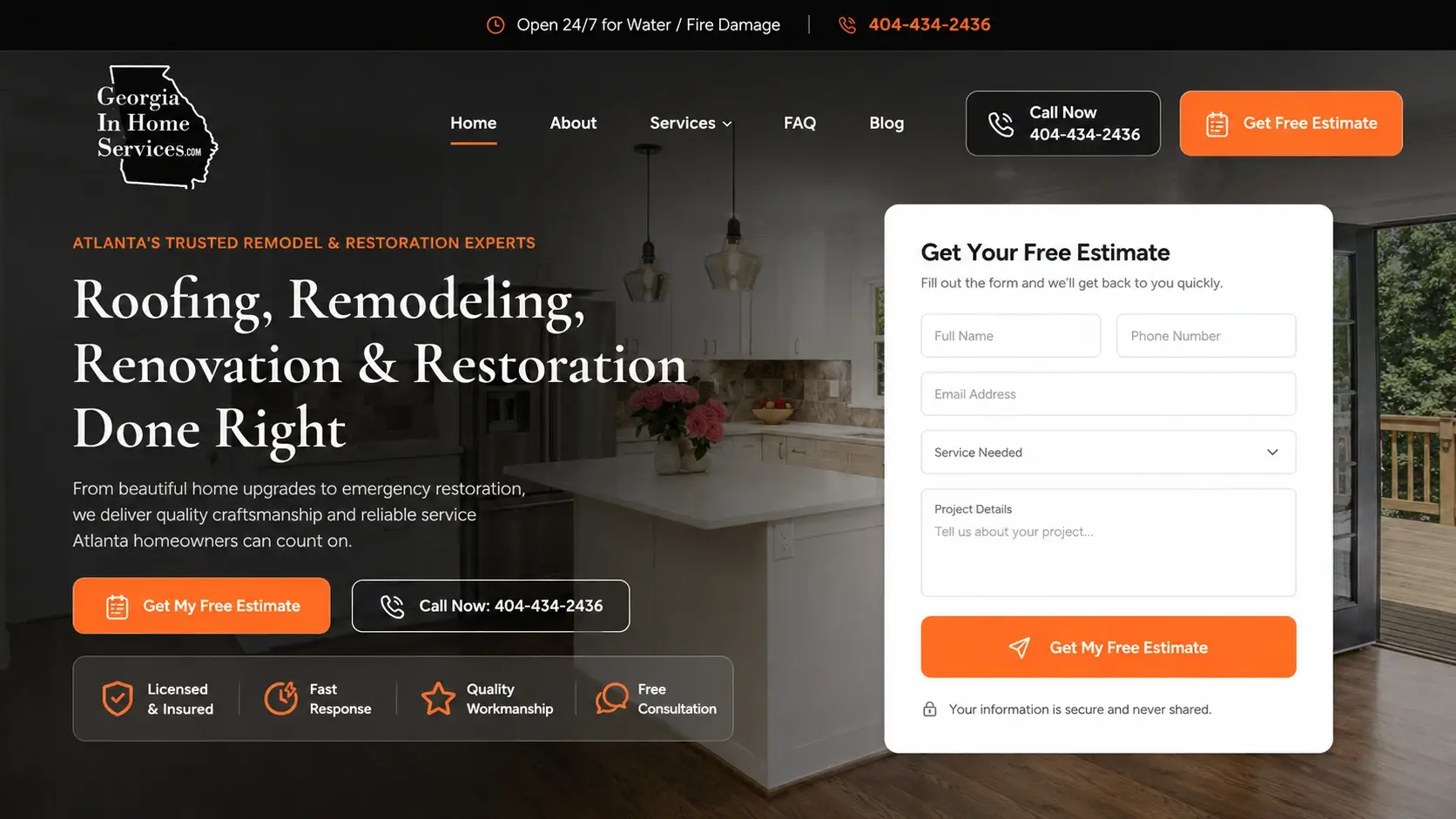
The 24/7 water and fire damage line ran across the top in small red type on a black bar. Red on black is a hard combination to read at the best of times, and this is the line somebody reads at eleven at night with water coming through the ceiling.
The hero underneath led with the company name in large white lettering, with the actual services squeezed below in smaller capitals as one run-on line: “Atlanta’s Premier Roof and Remodel Company REMODELING, ROOFING, RENOVATION & RESTORATION.” One button.
The rebuilt hero leads with the services instead: “Roofing, Remodeling, Renovation & Restoration Done Right,” under the eyebrow “Atlanta’s Trusted Remodel & Restoration Experts,” with a supporting sentence. Two buttons, four trust items, and a Get Your Free Estimate form. The emergency bar got a clock icon and proper contrast, and the header now carries both Call Now and Get Free Estimate.
Emergency restoration is an impulse call. If the number is hard to read, someone calls the next company instead. Everything else on this page can wait; that bar couldn’t.
Genuine reviews, presented like a plugin nobody styled
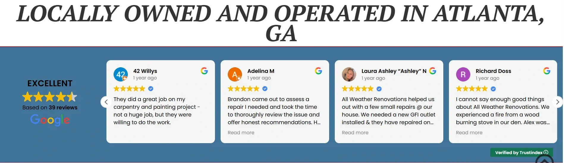
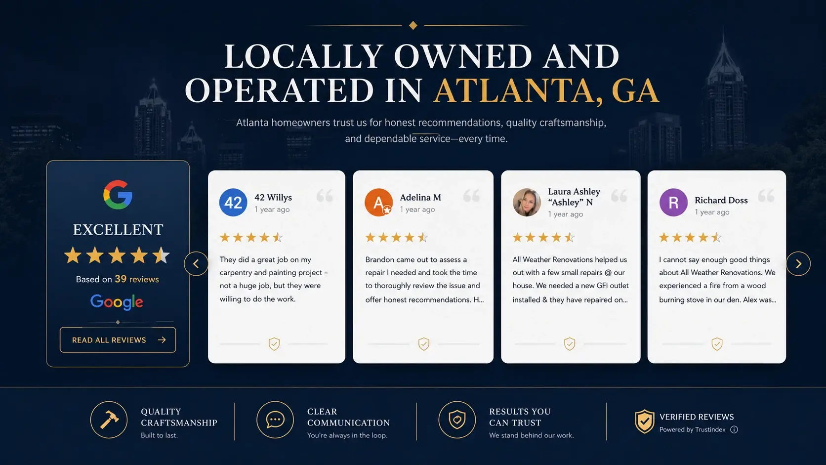
The heading sat as plain black text on white with nothing under it. The reviews were inside a blue band as four cramped cards with tiny navigation arrows, and the “Verified by Trustindex” tag was tucked into a corner where it did no good at all. The Google rating block on the left was small enough to miss.
The section was rebuilt on dark navy with a supporting line under the heading. The Google rating moved into a bordered panel with the logo, stars, “Based on 39 reviews” and a Read All Reviews button. The reviews became larger white cards with avatars, names, dates, gold stars and quote marks. A strip underneath adds Quality Craftsmanship, Clear Communication, Results You Can Trust, and Verified Reviews powered by Trustindex.
Reviews are the most persuasive content a remodeling company owns, and this section looked like a widget somebody dropped in and forgot. Giving it real space signals the company stands behind its record. The verification note earns its place too, because a homeowner who suspects reviews are fake discounts every one of them.
A 4.9 rating with nothing behind it
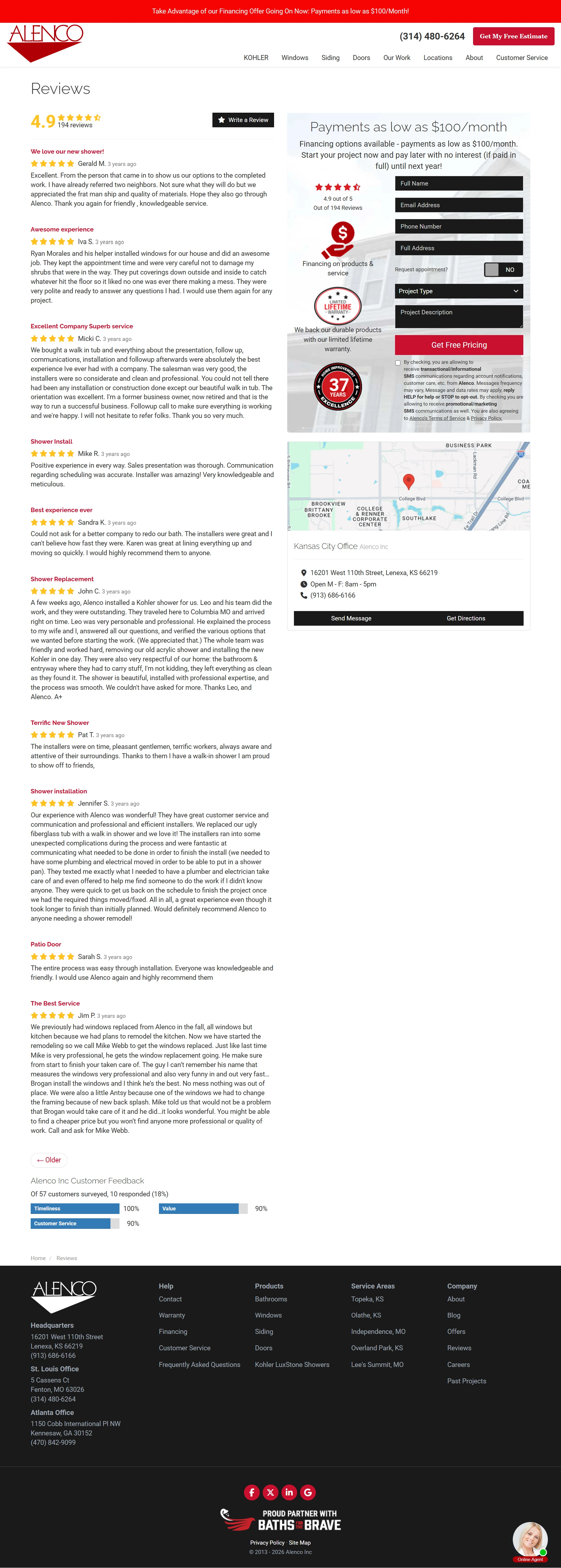
“4.9” and “194 reviews,” in small text next to a black button. Then review after review as plain text blocks running down the page.
An average score on its own is easy to doubt. What was missing was any sense of how that 4.9 was arrived at, or how deep the review base went.
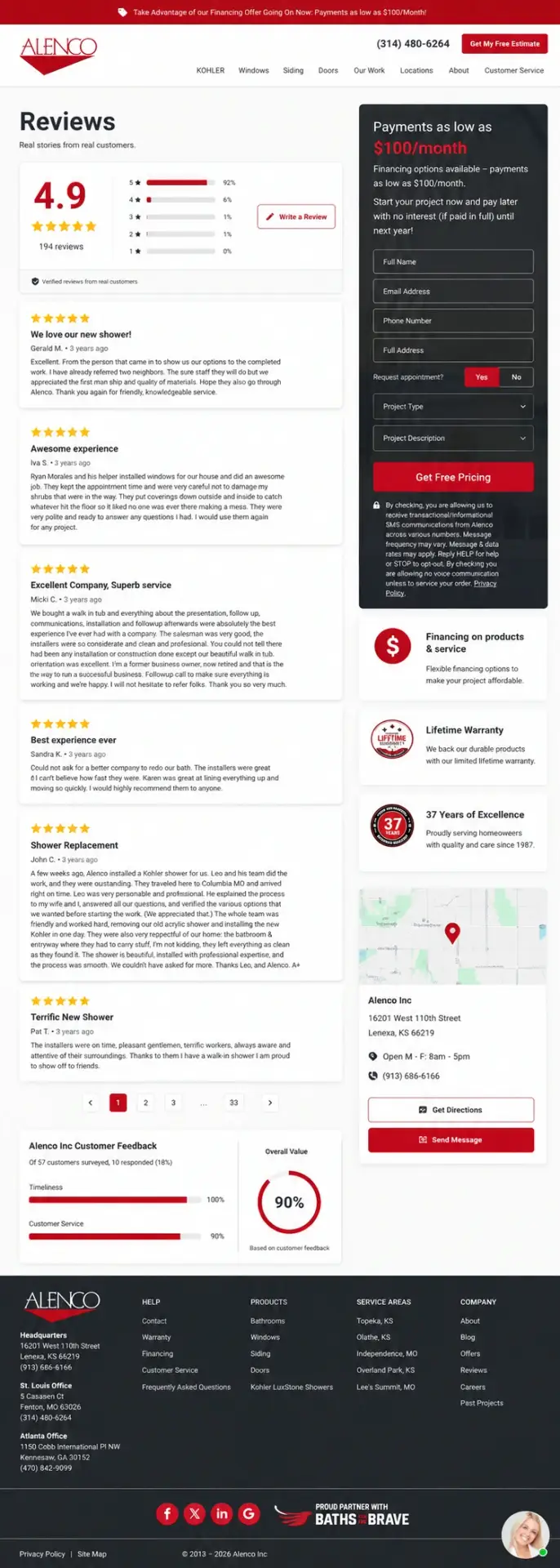
The rebuilt page puts the rating in a card with a bar chart breaking it down: five stars 92%, four stars 6%, three stars 1%, two stars 1%, one star 0%. Reviews became cards with gold stars and clear attribution, and the pagination now shows 33 pages. A customer feedback panel was added showing timeliness at 100%, customer service at 90% and overall value at 90%, from 57 customers surveyed.
The sidebar keeps its financing offer, “payments as low as $100/month,” and adds three cards above the map: Financing on products and service, Lifetime Warranty, and 37 Years of Excellence.
A distribution is more convincing than an average because it shows the working. Thirty-three pages of reviews says established company, not handful of testimonials. And that $100/month line in the sidebar quietly reframes a bathroom project for somebody who’d never have called about the full price.
A form field with its own label cut off
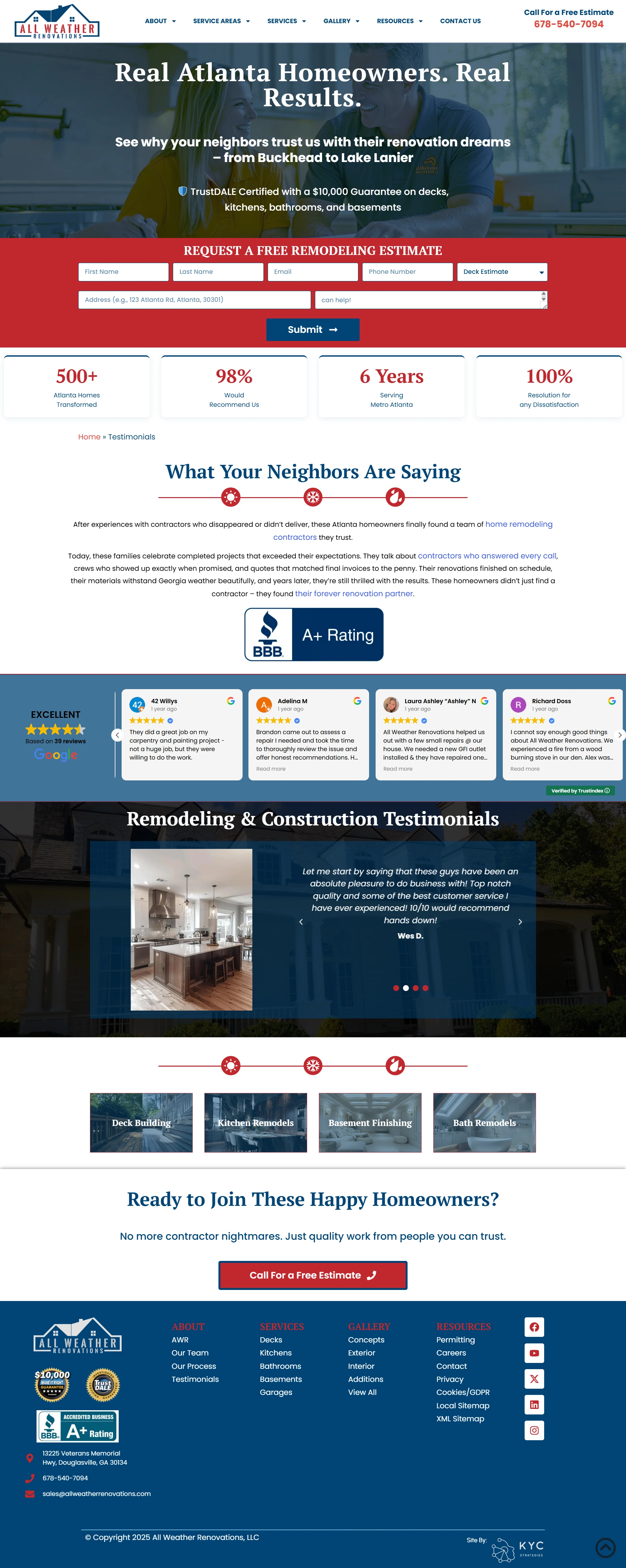
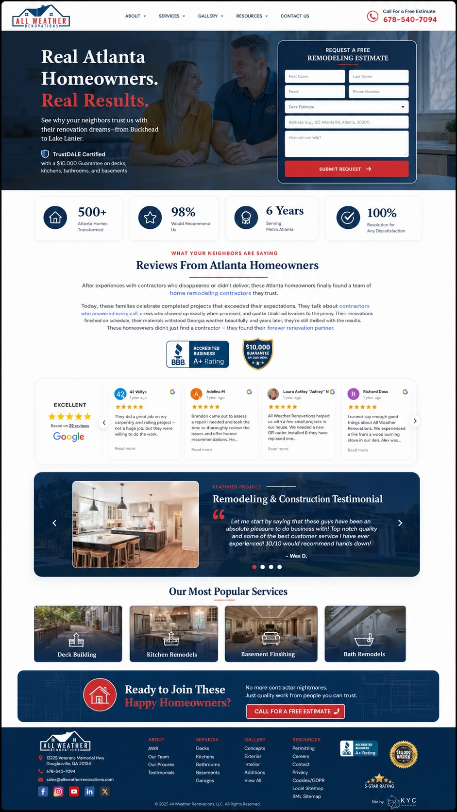
Seven fields stretched across a full-width red band in two rows. One of them had its placeholder text truncated, showing only “can help!” where the full question should have been.
That’s the sort of thing that makes a visitor pause, and a pause on a form costs enquiries.
The statistics underneath sat in thin outlined boxes, and the service tiles at the bottom used dark, dim photographs with the names printed over them.
The form moved into a card beside the headline rather than stretching across the page, which gives the fields room and lets the placeholder text fit. The four statistics (500+ Atlanta homes transformed, 98% would recommend, 6 years serving Metro Atlanta, 100% resolution for any dissatisfaction) moved into a solid navy bar. Service tiles got icons and a lighter treatment, and the BBB A+ rating and $10,000 guarantee marks were given proper placement.
“98% would recommend us” is a strong number. In an outlined box among three others it read like filler. In a solid bar it reads like a claim.
The financing answer was five screens down

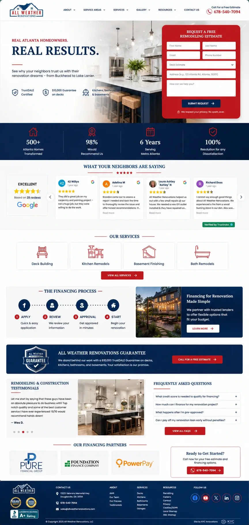
Cost is the reason most remodeling enquiries never get made. So a financing page has one job, which is to tell somebody quickly whether they can afford this.
The old page took a while to get there. An explanation of why to finance, a list of qualifying projects, a guarantee section, a four-step process written out as paragraphs, then a twelve-question FAQ. All of it set in wide centred blocks of text.
The condensed version puts the process into four labelled steps (Apply, Review, Approval, Start) next to a short line about working with trusted lenders, plus a Learn More button. The guarantee became its own band naming the $10,000 TrustDALE guarantee and the work it covers. Four financing questions stayed in an accordion with a link through to the rest. The lenders are shown by name: Pure Financial Group, Foundation Finance Company, PowerPay.
Naming the lenders is the part I’d keep if I could only keep one thing. “Financing available” sounds like a maybe. Three recognisable finance companies with logos sounds like a process that exists.
Ten answers behind ten identical grey bars
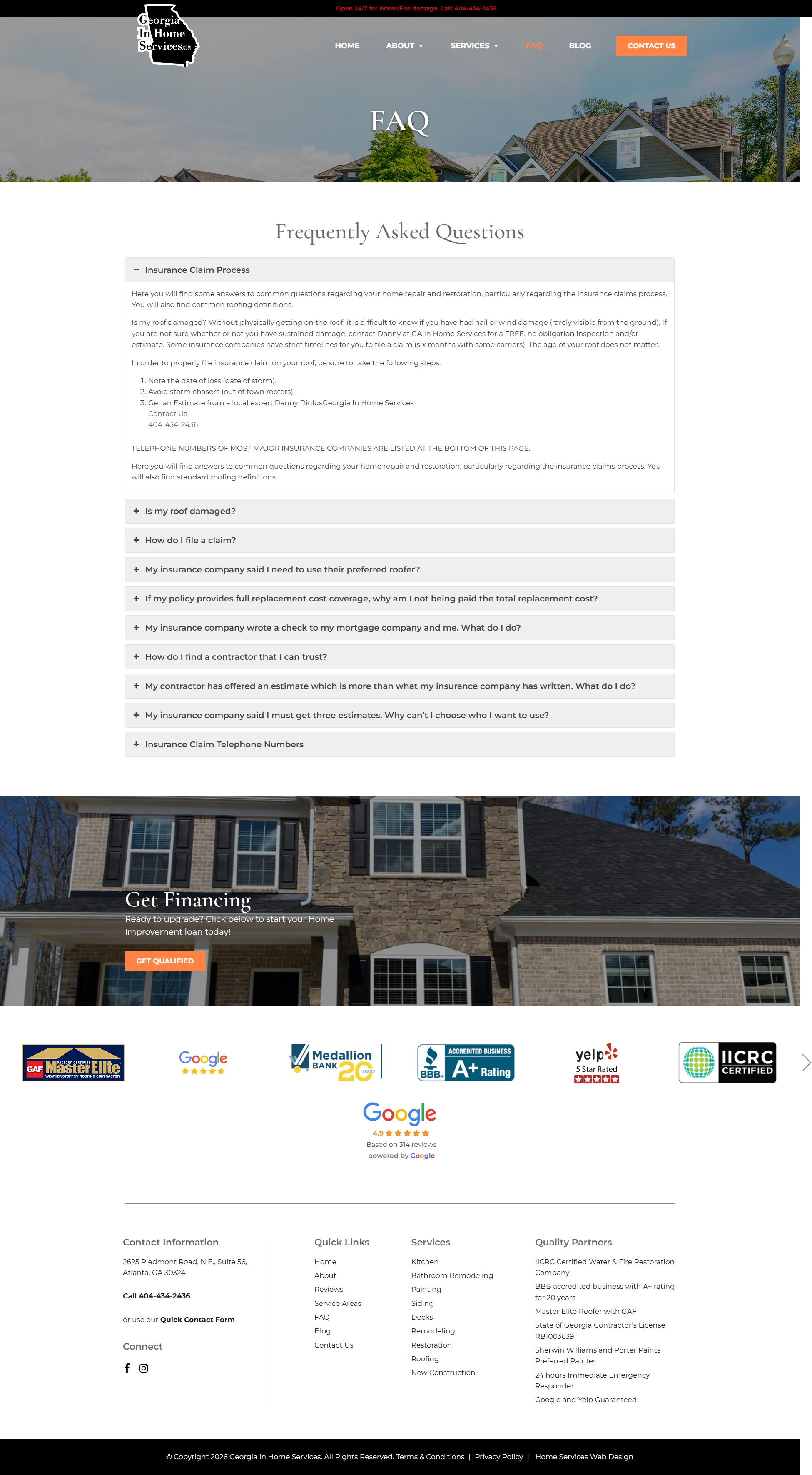
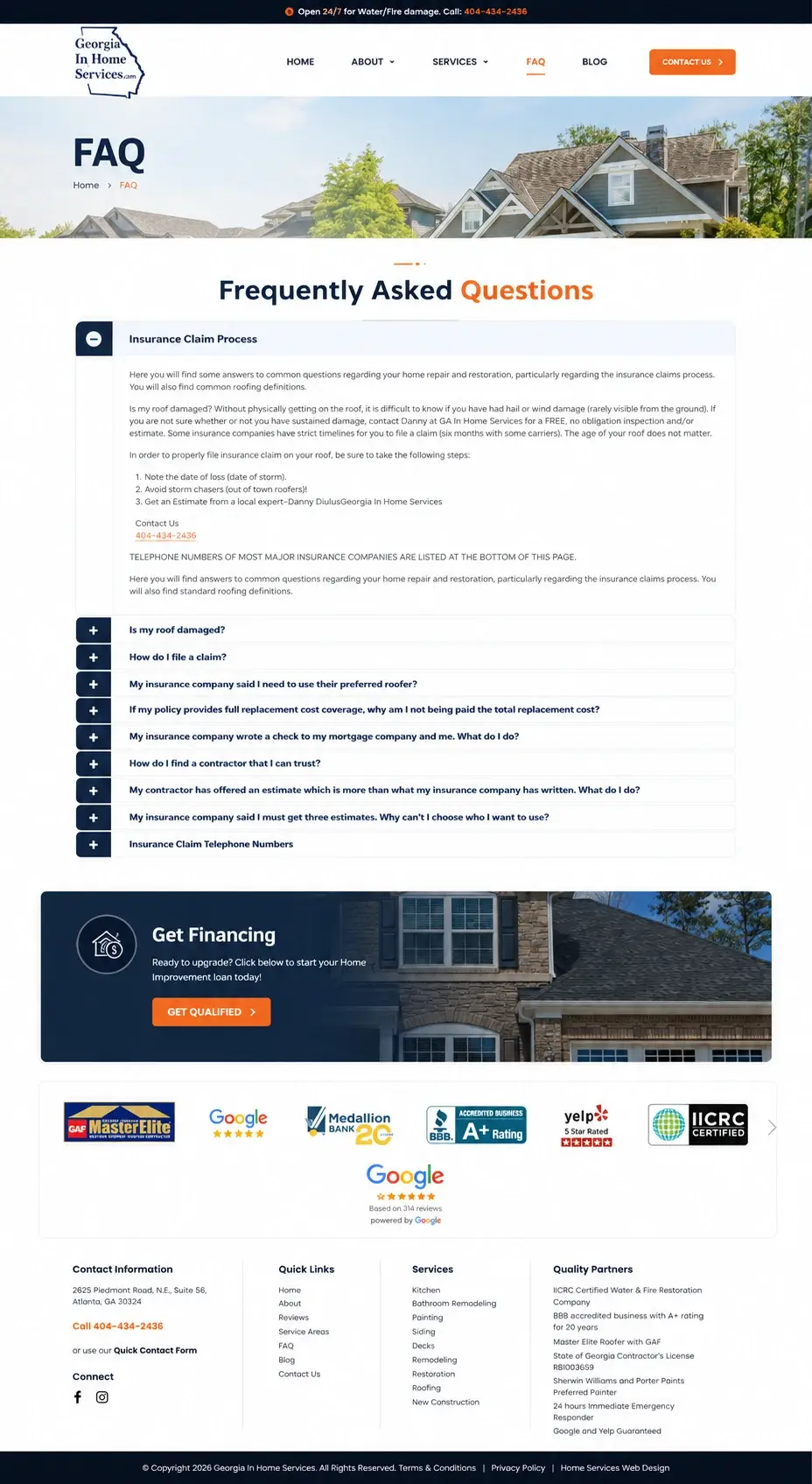
The FAQ covered exactly the right things: how to file an insurance claim, what to do when your insurer names a preferred roofer, how to find a contractor you can trust, what happens when your contractor’s estimate exceeds what the insurance company wrote. Real questions from people dealing with storm damage.
They just sat in ten identical grey bars with nothing to distinguish one from the next.
The financing offer at the bottom was a wide image band with the text sitting low on the photograph, hard to read against it. The accreditation logos were in a plain row.
The redesign gives the page a banner with a breadcrumb and restyles the accordion so questions separate properly and the open one is clearly marked. The financing band was rebuilt with the text on a darker panel and a Get Qualified button. The accreditation row became a bordered carousel carrying GAF Master Elite, Google, Medallion Bank, BBB Accredited A+, Yelp 5 Star Rated and IICRC Certified, with a Google widget below showing 4.9 from 314 reviews. The footer gained a Quality Partners column listing the Georgia contractor’s licence number RB1003639 alongside the certifications.
That licence number in the footer is doing something specific. Industry bodies tell homeowners to verify a contractor’s licence before signing anything, and most contractor sites make that impossible. Putting the number where anyone can check it is a small act of confidence.
Three screens of bank disclosure before the apply button
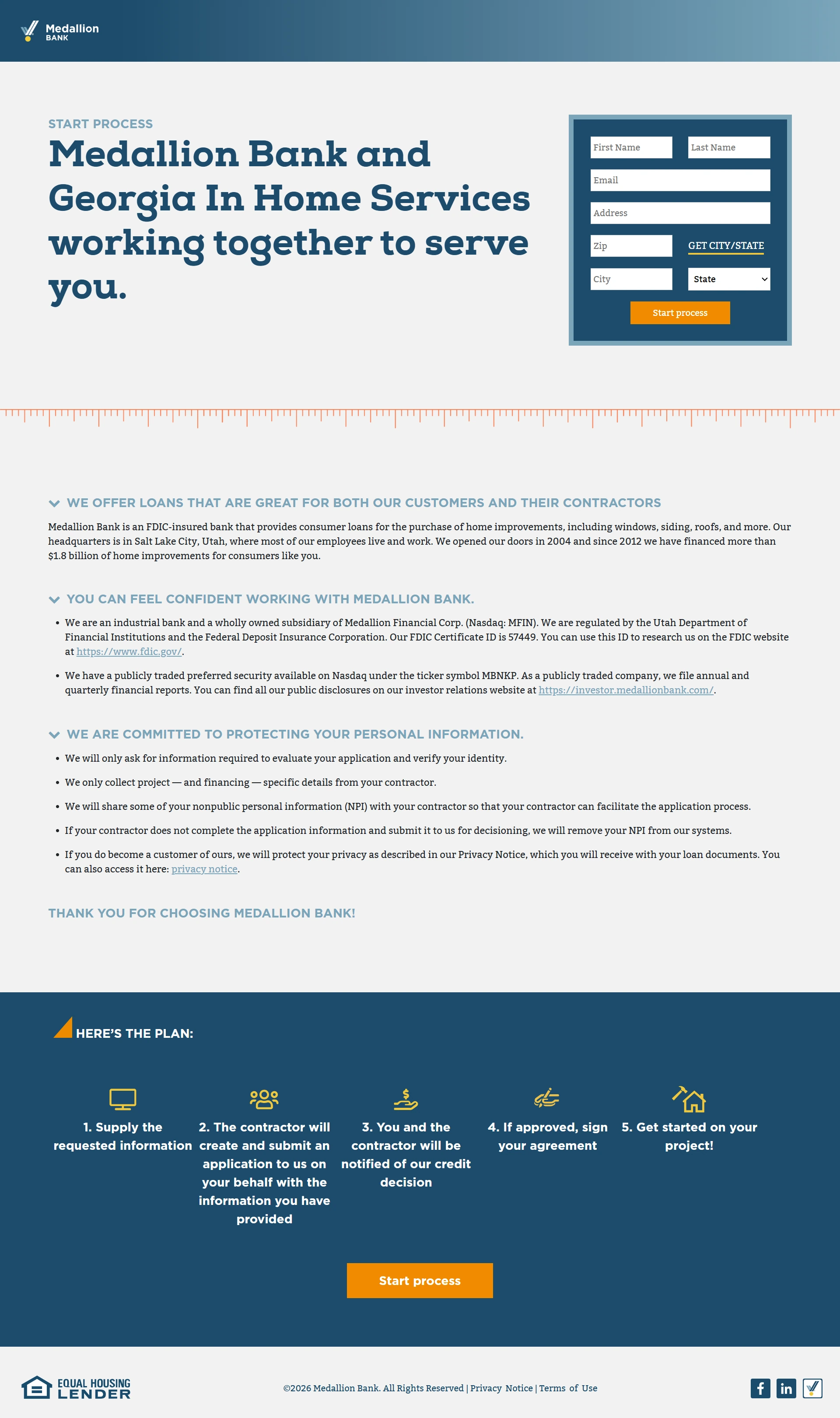
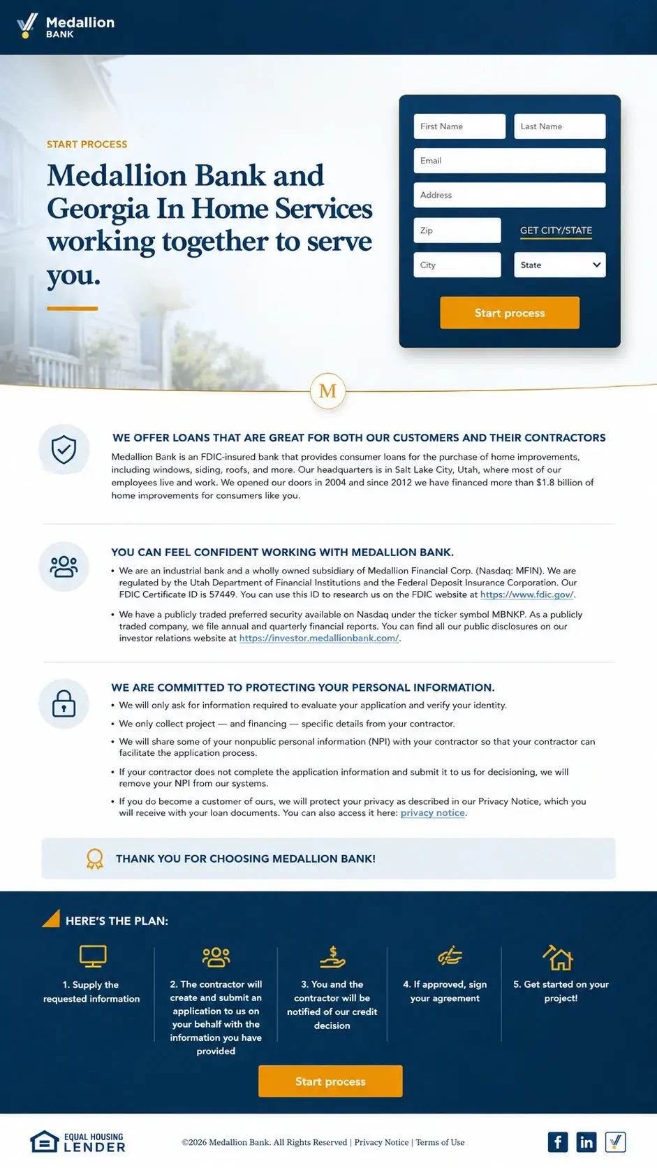
This is a co-branded application page, which means it sits between a homeowner and their loan. Every extra screen of scrolling on a page like that loses applicants.
The old version opened with a hero and form, then ran through three long expandable sections of lender information: the bank’s FDIC status, its Nasdaq listing, its certificate ID, and a full data-handling disclosure covering what gets collected and what gets shared with the contractor. Then the five-step plan, then the second apply button.
All of that information is legitimate and some of it is required. It was just laid out as wide blocks of running text with small chevron headings, which made it feel like more than it was.
The condensed page keeps everything and fits it on one screen. Each block got a circular icon and a dividing rule, the disclosure text was tightened into a readable column, the “Here’s the Plan” five-step flow runs across the width with icons, and both Start Process buttons and the Equal Housing Lender footer are in view.
The reassurance is still there for anyone who wants to read it. The people who are ready to apply can now reach the button.
“Less than $2 a day,” as a bullet point
No business name appears in either image. The copy refers to mold remediation in Atlanta, GA.
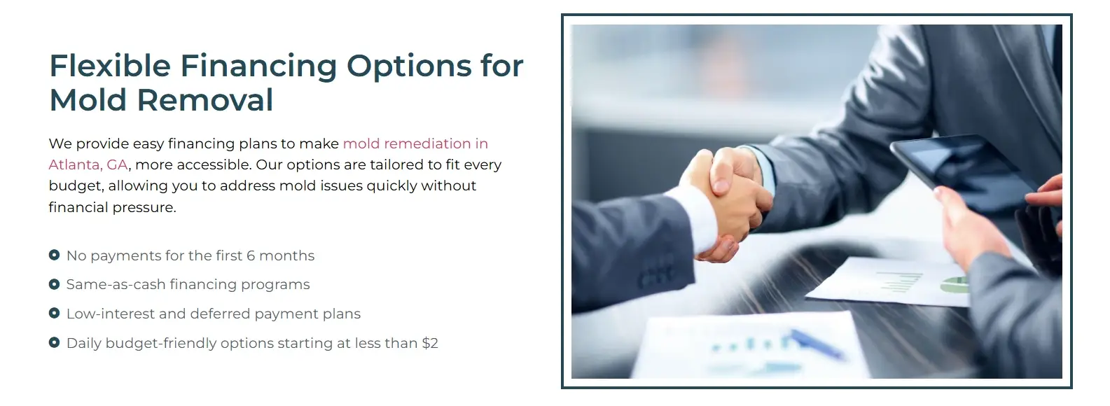
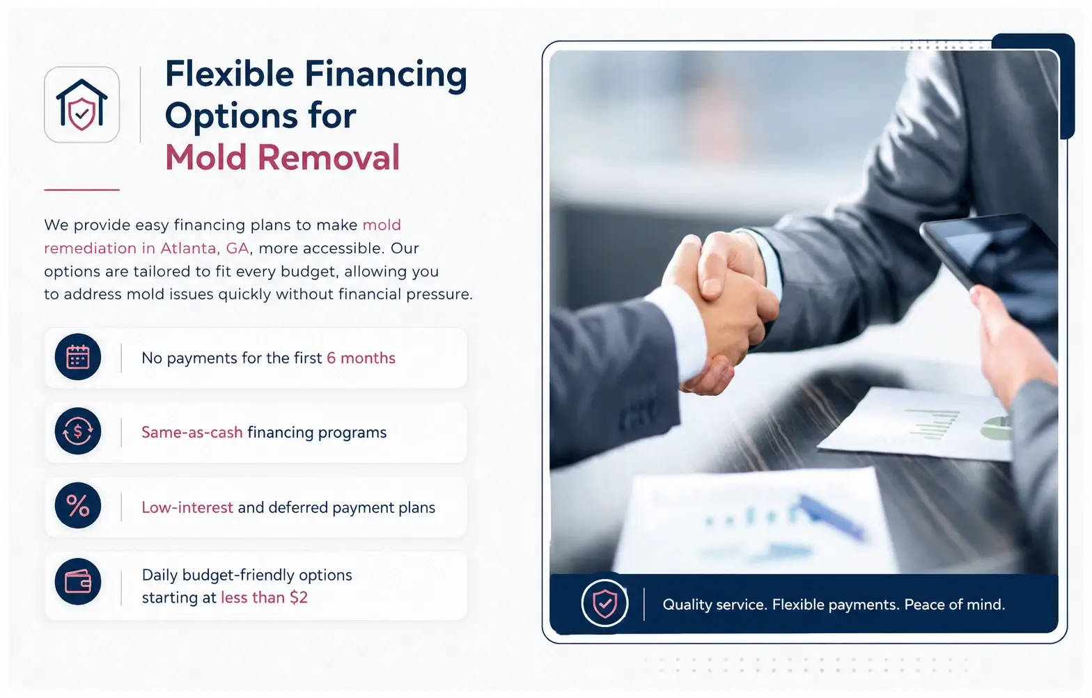
Four payment terms, listed as four small bullets under a paragraph. No payments for the first six months. Same-as-cash programs. Low-interest and deferred payment plans. Daily options starting at less than $2.
The numbers doing the persuading carried no more weight than the words around them.
Each term is now its own card with a circular icon, and the figures are picked out in colour: six months, same-as-cash, low-interest, less than $2. The heading was split across two lines with “Mold Removal” highlighted, an icon added beside it, and the photograph given a rounded frame with a caption bar reading “Quality service. Flexible payments. Peace of mind.”
Nobody budgets for mold. It’s discovered, not planned for, and the quote arrives at a bad time. “Less than $2 a day” is the line that turns an emergency expense into something a household can absorb, and as a bullet point it was easy to scroll past. Four separate cards make each term impossible to miss.
A note on scope
These cover the 32 pairs supplied. Everything described is visible in the screenshots: layout, copy, controls, content. Loading speed, mobile behaviour, whether the forms actually submit, and code quality weren’t assessed, because none of that can be judged from an image. The wider patterns show up across the market data we publish.
Disclaimer
- These redesigns are presented for commentary and critique, and are published under fair use.
- Zainfy has no affiliation with any of the businesses shown here, and no work was carried out for any of them.
- If any business would like its screenshot removed, Zainfy will remove it immediately — email info@zainfy.us.