Author: Zayn Shah
If you own an Alpharetta remodeling company, your website is the first interview, not a brochure. The North Fulton buyer conducting it may work along the GA-400 Technology Corridor, use software all day, and judge your site with the same impatience he brings to a bad app.
He is not checking whether the colors feel modern. He is asking whether you look organized enough to handle a high-consideration renovation in Avalon, Windward, Downtown Alpharetta, Halcyon, or Haynes Bridge. A slow page, borrowed photo, vague headline, or broken form answers that question before your crew ever gets a chance.
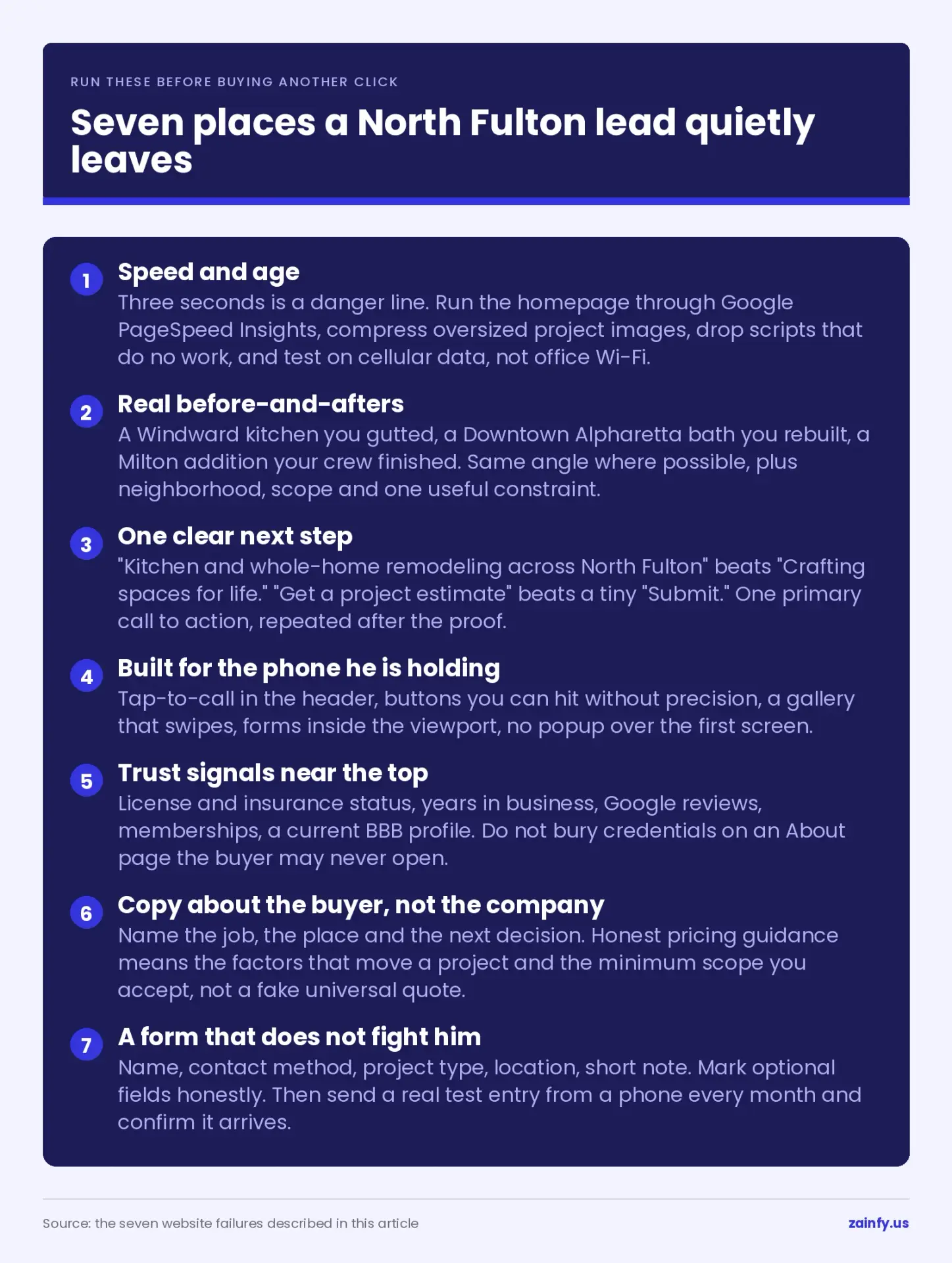
These seven contractor website mistakes are not cosmetic. Each is a place where a homeowner can leave without calling while comparing you with two other North Fulton remodelers from a phone.
Do not respond by buying more traffic. More visitors sent into the same leaks only produce more silent rejection. Fix the site that receives them first.
1. It loads too slowly, and it looks like 2016
An Avalon homeowner taps your result on a fast phone. The hero image stalls, the menu shifts, and a dated template appears after the moment has passed.
Three seconds is a danger line. Past it, you are asking a buyer to wait before seeing a reason to trust you. A site that looks a decade old compounds the problem: old design starts to feel like old process, even when the work on site is current.
Run the homepage through Google PageSpeed Insights. Compress oversized project images, remove scripts and plugins that do no useful work, and test the page on cellular data rather than office Wi-Fi. Wix, Squarespace, and WordPress can all load well or badly; the platform name is not the diagnosis.
If the structure, typography, navigation, and mobile behavior feel dated, stop treating it as a tune-up. Rebuilding is cheaper than defending a first impression that keeps losing.
2. There are no before-and-afters, or the photos are stock
Remodeling is visual proof. A North Fulton buyer wants to see what you changed, how difficult the starting point was, and whether your finished work matches the level he expects.
A Shutterstock kitchen cannot answer any of that.
Show a real Windward kitchen you gutted, a Downtown Alpharetta bath you rebuilt, or a Milton addition your crew completed. Pair the before and after at a matching angle when possible. Add the neighborhood, project type, scope, and one useful constraint. Those details turn a gallery from decoration into evidence.
A thin portfolio creates the opposite message. Ten stock images may look expensive, but they could belong to any contractor. One documented local project is more credible by connecting the place, problem, and result.
If you do not have usable photos, fix the jobsite process. Assign one person to capture the same views before demolition, during work, and after completion.
3. The visitor cannot tell what to do next
The homepage has seconds to answer two questions: what do you build, and how does the homeowner start?
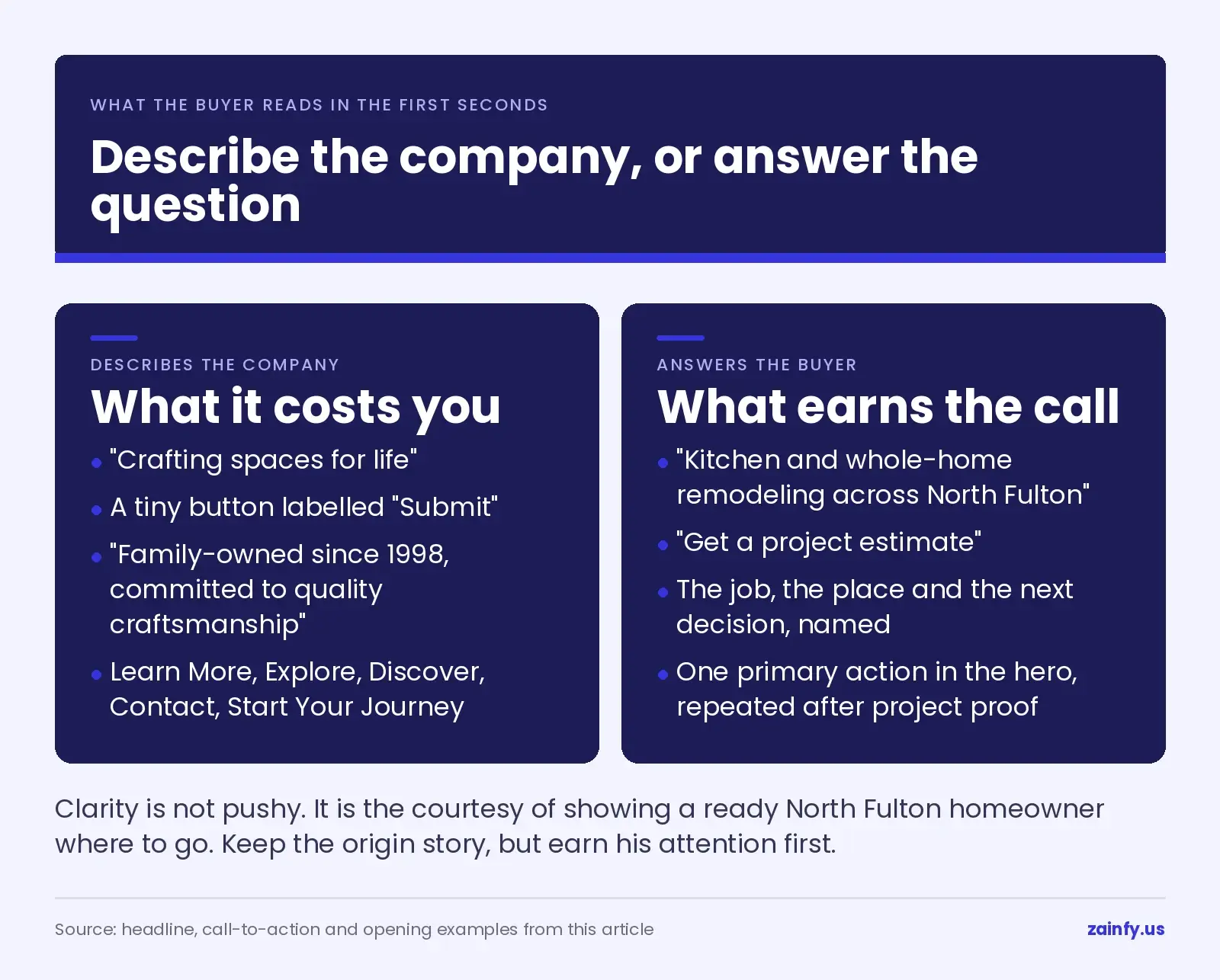
A Halcyon buyer should see a direct headline and one primary action above the fold. “Kitchen and whole-home remodeling across North Fulton” tells him more than “Crafting spaces for life.” “Get a project estimate” is clearer than a tiny button labeled “Submit.”
Pick one primary call to action. Put it in the hero, repeat it after project proof, and keep the wording consistent. The phone number can remain visible as the faster alternative.
Do not make the buyer choose among “Learn More,” “Explore,” “Discover,” “Contact,” and “Start Your Journey.” Those labels describe navigation, not a next step. The visitor who decided to inquire should not have to inspect the menu to find the form.
Clarity is not pushy. It is the courtesy of showing a ready North Fulton homeowner where to go.
4. It was not built for the phone he is holding
Picture the real comparison: 9pm, a North Fulton living room, three contractor tabs open on one phone.
One site requires pinching to read. Its gallery arrows are too small to tap, the menu covers the screen, and the phone number disappears below a banner. The other site works with a thumb.
The second contractor gets the call.
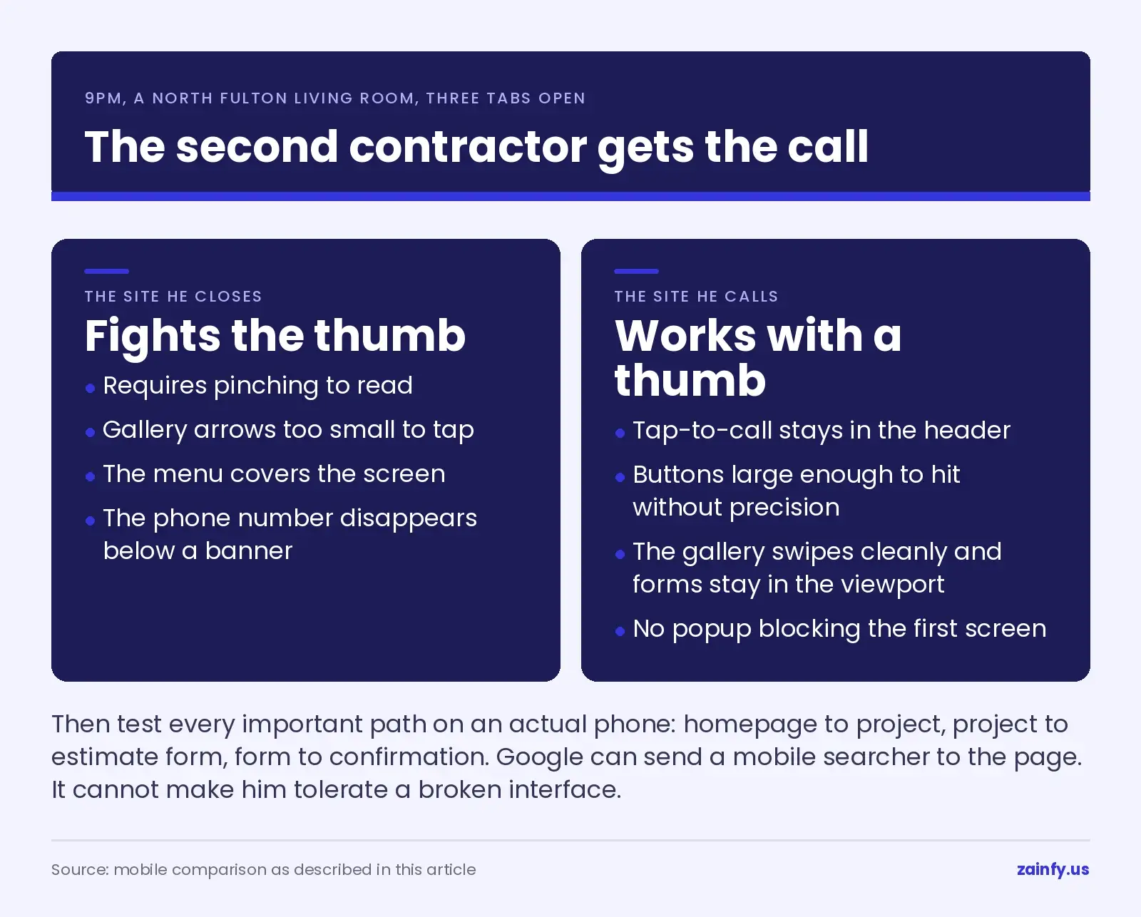
Build mobile first. Keep tap-to-call in the header. Make buttons large enough to hit without precision. Let the gallery swipe cleanly, keep forms inside the viewport, and remove popups that block the first screen. Then test every important path on an actual phone: homepage to project, project to estimate form, form to confirmation.
Google can send mobile searchers to the page, but it cannot make them tolerate a broken interface. The device is not a smaller desktop. For an Alpharetta remodeler, it is often the entire sales visit before the first conversation.
5. Nothing near the top says the contractor is trustworthy
A high-consideration buyer checks credentials before personality. Make the evidence easy to verify.
Near the top of the page, show the services and area, then place trust signals where hesitation begins: license and insurance status, years in business, Google reviews, memberships, and a BBB profile or badge when it is legitimate and current. Link claims to the underlying proof where practical.
Do not bury every credential on an About page. The buyer comparing a Johns Creek renovation may never open it. Put a concise trust row near the hero, reinforce it beside project proof, and show reviews next to the service they describe.
The Google Business Profile and website should also agree on the company name, phone number, service area, and review story. Mismatched details create doubt.
Badges alone are not trust. A real review, a named North Fulton project, and a credential that can be checked carry the weight.
6. The whole site is about the company, not the buyer
Compare two openings.
“Family-owned since 1998, committed to quality craftsmanship” describes the company. It does not tell an Alpharetta homeowner whether you solve his kitchen problem, work in his part of North Fulton, or fit the project he is considering.
A buyer-focused opening names the job, the place, and the next decision. It can also give honest pricing guidance: not a fake universal quote, but the factors that move a project up or down and the minimum scope your company accepts.
The GA-400 technology-corridor buyer reads this like a product page. He scans for fit, proof, constraints, and a clear action. He does not want a wall of agency language or a company history before the answer.
Keep the origin story, but earn his attention first. Show that you understand the property, decision, and risk he is carrying. Then explain why your process is credible enough to handle it.
7. The form is where the lead quietly leaks out
The buyer reaches the final step, and the form asks for ten fields, a detailed budget, a start date, a project essay, and information he does not have yet. He closes it.
You never know he was there.
Use a short quote-request form: name, contact method, project type, location, and a brief note. Mark optional fields honestly. Keep the phone number visible for the person who would rather call, and show a clear confirmation after submission.
Then test the whole path every month. Send a real entry from a phone. Confirm the email arrives, the notification reaches the right person, the reply address works, and spam filtering does not swallow it. A beautiful form that delivers nowhere is a broken lead channel.
The North Fulton lead did not fail to convert because he lacked interest. The form fought him at the exact moment he tried to act.
Alpharetta remodeler websites: quick answers
[wps_faq style=”classic” question=”Why is my remodeling website not getting leads?”]Usually the site is losing interested visitors at one of seven points: speed, project proof, call to action, mobile use, trust signals, buyer-focused messaging, or the quote form. Check those before assuming Alpharetta traffic is the problem. A visitor who cannot verify the work or complete the form never becomes a lead in your reports.[/wps_faq]
[wps_faq style=”classic” question=”Do Alpharetta remodelers actually need a website?”]Yes. An Alpharetta remodeler needs a website because North Fulton buyers verify the company online before calling, especially in a technology-corridor market accustomed to polished digital experiences. The site gives you a place to own project proof, credentials, reviews, service details, and the inquiry path. A directory profile cannot present that full case on your terms.[/wps_faq]
[wps_faq style=”classic” question=”Should I use a template or hire someone to build my contractor site?”]A template can work if it loads quickly, presents real projects, guides the buyer, works on a phone, proves trust, and delivers form submissions. The risk is not the template label; it is accepting its defaults without testing these seven points. Hire help when the structure fights the business, several failures appear together, or patching costs more than rebuilding correctly.[/wps_faq]
Run the seven checks before buying another click
Open your own site on a phone tonight. Time the first load, find a real project, locate the estimate button, verify the credentials, and submit the form. Fix the worst failure this week.
Do not buy more traffic while the site leaks. Sending additional visitors to a slow, proof-light page only produces rejection faster. And the search side takes its own time — how long that actually runs.
When patches are no longer enough, remodeler web design in Alpharetta is the commercial path for rebuilding the experience properly.
The useful number is not how many visitors arrived. It is how many ready North Fulton buyers found enough proof and a working path to call.